Sherwin Williams Alabaster 7008: A Timeless White Paint Choice
Alabaster (SW 7008) was chosen as the Sherwin Williams Color of the Year in 2016, and this soft white paint has endured as a classic, popular choice for both interiors and exteriors.
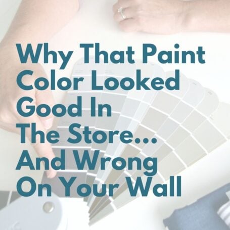
We all know picking paint isn't an easy task - but picking white paint should be easy, right? It's kinda just ...white ...not a bold blue or a deep green.
Well, the world of white paints is surprisingly diverse. But don't worry, discovering the undertones of white paint doesn't have to be complicated.
Today we'll look at the specifics of Alabaster white paint by Sherwin Williams, how it compares to other popular white paint colors, and see it in action in real-life homes.
Ready to dive in?
Great! Let's talk about Sherwin Williams Alabaster and whether this white paint color is right for your home.

In This Article:
Choosing paint color shouldn’t feel this hard.
If you’ve ever painted a room and thought, well… that looked better on the swatch, grab my free guide. I’ll show you the simple trick for spotting undertones before you paint.
What Color Is Sherwin Williams Alabaster White?
Sherwin-Williams Alabaster is a calm, peaceful neutral white that gives a light and airy feel to a space while not appearing too bright or stark.
Is Alabaster warm or cool?
Alabaster SW 7008 is a barely warm white thanks to a subtle hint of beige. This balance is one of the reasons it's so popular - it brightens a space while still giving it a cozy, inviting feel.
What are the undertones of Alabaster white?
White paint colors can have a wide range of undertones - blue, pink, yellow or even purple. SW Alabaster has a slight beige undertone with a hint of yellow which provides its creamy warmth and saves it from feeling too stark.
Lighting plays a big role in how Alabaster appears. In rooms with southern exposure or strong afternoon light, Alabaster's brightness will stand out. In rooms with less natural light or northern-facing, Alabaster will warm them with that creamy beige undertone.
(You can save yourself a ton of wrong paint grief by knowing this trick to figuring out neutral paint undertones before committing to a color!)
Does Sherwin Williams Alabaster look yellow?
If that touch of yellow undertone concerns you, rest easy. Because of its neutral base, SW Alabaster generally will not look yellow. That said, it's always wise to test out a paint color in your own home before making a commitment as your lighting and surrounding finishes can influence how it appears.
What is the LRV of Alabaster?
LRV (light reflective value) measures how much light a paint color reflects on a scale from 1 (blackest black) to 100 (true white). For more deets, check out my post explaining what light reflective value means and why it matters.
Alabaster by Sherwin Williams has an LRV of 82. It's definitely not a bright reflective white, but it won't wash out either in high sunlight conditions. In fact it's a go-to exterior color (more on that below) because that soft subtle hue behaves well as both a primary and trim house color.
You May Also Like


Alabaster Paint Color In Real Homes
Let’s take a look at how this white paint color performs in real homes.
Alabaster exterior paint
Alabaster is adaptable to nearly any architectural style - traditional, contemporary, rustic - and works beautifully as both a primary exterior color and a trim color. If you love a monochromatic look, using Alabaster Sherwin-Williams on both the body and trim creates a peaceful, cohesive exterior.
Alabaster entryway
Sherwin Williams Alabaster white goes especially well with darker, contrasting colors. This homeowner used Sherwin Williams Iron Ore on the front door, while the abundant natural light highlights Alabaster's brightness.

Alabaster living room and office
In this living room, the walls, cabinets and trim are all painted SW Alabaster. Lizzy of Lizzy Designs Blog describes it as her favorite white and go-to choice.
My own office walls are also painted Alabaster and I completely agree - it's not too white, not too bright - just right for creating coziness. Alabaster has a way of receding peacefully into the background, allowing furnishings and decor to shine.


Alabaster bedroom
Those spa-like qualities makes it an excellent bedroom wall color for promoting rest and relaxation. Notice how SW Alabaster politely stands back and allows statement elements like that moody shiplap headboard to take center stage.

Alabaster kitchen cabinets
Does Alabaster work well on kitchen cabinets? You betcha!
Paired with black hardware, Alabaster Sherwin Williams creates a clean yet sophisticated look in this contemporary kitchen.
And speaking of cabinets, these living room built ins are painted Alabaster white. In both photos, you can see how well the wood floors complement the warmth of Alabaster.

Alabaster bathroom, basement, and laundry room
In this project, Clark + Aldine created livable space in an unused basement for a growing family. I'm loving the dramatic feel created by offsetting Alabaster White walls with Tricorn Black SW 6258 for the ceiling and trim. Again, those wood floors add another layer of wow.
Notice how Alabaster nods to its beige side in the basement while in the bathroom with more natural light it appears whiter.


This pet feeder area in the laundry room by Room for Tuesday is both functional and cute (those dog pics!!). If you're concerned about pairing Alabaster's off-white shade with white appliances, don't worry. They won't match exactly but they'll blend well together, and the dark flooring and door - and those dog pics - are what captures the eye.

Alabaster vs Other White Paint Colors
Comparing whites side by side is one of the best ways to choose the right one. Let's see how Alabaster stacks up against a few other popular white paint choices.
Shoji White vs Alabaster
Although both colors belong to the white category, Shoji White SW 7042 sits on the cusp between cream and greige. With an LRV of 74, Shoji has more depth and obvious beige-greige undertones than Alabaster. Both paints are versatile options for walls, trim, and cabinets.

Alabaster vs Pure White
Pure White SW 7005 is a brighter version of Alabaster with enough warmth in the slight yellow undertone to save it from being too stark. Both colors straddle that line between warm and cool. While Alabaster is widely used throughout the home, Pure White is best for trim and baseboards due to it being exactly what its name declares: a pure white.

Dover White vs Alabaster
If you're searching for a cozy white, Dover White SW 6385 will do the job. Dover and Sherwin Williams Alabaster are identical in their light reflectiveness, but the similarity stops there. Dover has more depth and color, with a stronger yellow undertone that makes it a warmer white overall. If you prefer a white that won't look yellow, SW Alabaster is the safer choice.

Alabaster vs Snowbound
These two are so similar it can be tough to choose between them. Nearly identical on the light reflective scale, Alabaster leans a bit warmer due to its beige/yellow undertone, while Snowbound has slightly more gray and even taupe in its base. Like Pure White, Snowbound is most commonly used as a trim color.

I always recommend testing paint on your walls before making a commitment, and viewing Alabaster paint samples next to several other white paint shades will make your paint decision so much easier.
Looking to test paint colors but don't want to paint? Samplize offers peel and stick paint samples from all major paint brands delivered to your door so you can put them up on the wall with no mess.
You May Also Like


What Color Trim Goes With Alabaster Walls?
SW Alabaster is incredibly versatile and can be used on walls, doors, ceilings and trim. You can also go with Alabaster on both walls and trim for a seamless look like this baby boy nursery.
If you prefer a subtle contrast, Alabaster walls with Pure White (SW 7005) trim is a classic option. In this home office, Alabaster walls reflect the warmth of the wood floors and furnishings and those subdued beige tones are nicely complemented by the Pure White trim.

This homeowner chose Alabaster as the trim color alongside darker walls in Gossamer Veil for more contrast in this elegant dining area.

Alabaster Coordinating Colors
What colors go with SW Alabaster? Pretty much everything.
For a soft, modern neutral contrast, try SW Agreeable Gray. If you'd like more drama, SW Peppercorn is a gorgeous soft black. Don't forget about your furniture pieces; warm toned leathers and natural wood finishes beautifully complement Alabaster's warm beige undertones.

When Alabaster Might Not Be The Best Choice
While Sherwin Williams Alabaster is incredibly versatile, there are a few situations where it may not be the best fit. If your home has very cool-toned finishes - such as blue-gray tile, cool marble, or icy quartz -Alabaster’s subtle beige warmth can sometimes feel slightly out of place. In spaces with minimal natural light, it can also read more creamy than expected, especially when paired with warm bulbs.
If you’re drawn to a cleaner or more modern look, a crisper white like Pure White or Snowbound may feel like a better match. This is why sampling is always key!
Is Sherwin Williams Alabaster White Right For Your Home?
Sherwin Williams Alabaster continues to be a favorite for a reason - it’s soft, balanced, and incredibly easy to live with. Whether you’re painting walls, cabinets, trim, or even an exterior, Alabaster adapts beautifully to a wide range of styles and lighting conditions without feeling stark or cold.
That said, white paint works best when it’s part of a bigger plan. If you want to make sure Alabaster (or any white) works seamlessly throughout your home, the next step is understanding how all your colors work together. Be sure to check out Easy Steps to Create a Whole House Color Palette, where I walk you through how to choose colors that flow from room to room without second-guessing.


P.S. There's no better way to create a cohesive feel than with color, but in order to avoid mistakes and get an updated look you've got to understand color like a designer.
Inside my online course, Color Made Clear, I will teach you exactly what you need to know about selecting colors for your home in everything from paint colors, to flooring and carpet, to fabrics so you can make confident color decisions and get the exact look and feel you're going for. - Even if there are finishes in your home you can't change, I'll show you how to use color to distract from them for an updated look!
