8 Tips For Choosing Paint Colors
Today I’m continuing my quest to making choosing paint colors for your home easier for all of you. We've already talked about neutral paint colors and how to choose the right one, but chances are, you're still staring at a few different colors or shades that you trying to decide between - and that's where today’s post comes in.
I've learned the hard way so that you don't have to. These are my 8 best tips for choosing paint colors for your home, and they'll help you avoid common color mistakes and choose paint with confidence.

In This Article
Choosing paint color shouldn’t feel this hard.
If you’ve ever painted a room and thought, well… that looked better on the swatch, grab my free guide. I’ll show you the simple trick for spotting undertones before you paint.
Best Tips For Choosing Interior Paint Colors
Tip #1 - Don't pick your paint color first
I know it feels natural to get the "big" decision out of the way first, but when choosing paint colors for your home, this approach can easily backfire.
It's much easier to choose a paint color that works with your furniture and decor than it is to decorate around a paint color you've already committed to. Let the items you already own - or plan to use - guide your color choice.
Tip #2 - Start with paint color inspiration
Pinterest is a great place to start when choosing paint colors for your home. Create a board for each room and start pinning spaces that catch your eye. Once you have about 10 images, you’ll begin to notice the colors, styles and overall feel you're drawn to.
Would you believe that the inspiration for the wall color used in about 90% of my home came from a Starbucks coffee mug? Yep!
I love gray, but I didn’t want my house to feel cold (or like a prison cell) so I chose a warm greige that works beautifully with my slate gray furniture while still feeling inviting and comfortable.

In my son’s airplane-themed baby nursery the inspiration came from a baby blanket I received while pregnant. I used it as a starting point to choose fabrics in blues and greens, then selected a very light but bright green for the walls. Even though it's green, it still reads as a neutral because the rest of the room does the talking.
Which leads me to the next tip...

Tip #3 - When in doubt, stick with neutrals
I’m not saying you should avoid color altogether - color is great! But when choosing paint colors for your home, it's important to decide where in the room you want the attention to go.
If you want the walls to be the star, then heck, go bold - but keep everything else in the room more neutral so you don’t end up with too many colors competing. This is why bold paint colors often work so well in bathrooms. Most bathrooms already have neutral finishes like white tile and fixtures, so bold color doesn't have to compete.
If you're unsure where to start, I shared 12 neutral paint colors in a previous post to help you narrow things down.
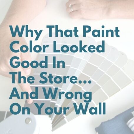
Tip #4 - Always test paint colors in your space
Buy testers in a few shades and paint large test areas on multiple walls. This lets you see how the color looks as the light changes throughout the day.
Try not to test paint directly next to white walls - it can skew how the color appears. If that's unavoidable, paint a larger test area so you can get a better read.
Almost all paint brands offer affordable tester samples, and they're well worth spending a little before purchasing gallons of paint. Plus leftover samples are great for touch-ups or other small painting projects later.
Leave the test patches up for at least a week so you can see the color in morning, afternoon, and evening time in natural and artificial light.

A quick note on lighting
One thing many homeowners don’t realize is how much lighting affects paint color. Natural light, artificial lighting, bulb temperature, and even which direction your room faces can dramatically change how a color looks. A warm gray may lean yellow in a south-facing room, while the same color can appear cooler in a north-facing space. This is why testing paint colors in your home is such a crucial step.
Looking to test paint colors but don't want to paint? Samplize offers peel and stick paint samples from all major paint brands delivered to your door so you can put them up on the wall with no mess.
Tip #5 - Test paint colors against furniture and fabrics
Don’t only test paint colors on the walls. Paint a piece of poster board and hold it up next your sofa, rug, or other major pieces in the room to see how it looks.
You're not trying to match exactly - but you do want to check that the undertones work nicely together. This step alone can save you from ending up with a color that feels "off" once everything is in place.
Tip #6 - Choose the right paint sheen
Any sheen in a paint will accent flaws, so if your walls aren't perfect, less sheen is your friend.
Here's a quick breakdown to help you choose:
- Flat (Matte): No shine. Perfect for ceilings and low-traffic areas like living rooms and bedrooms.
- Flat Enamel: Almost no shine but a bit easier to clean than flat. A good option if you have kids or pets.
- Eggshell Enamel: Slight shine. Works well for moderate-traffic areas and living rooms. In my experience most scuffs wiped off easily with a damp cloth.
- Satin Enamel: More shine and very durable. Ideal for high-traffic areas, kitchens and bathrooms. Easy to clean.
- Semi-Gloss Enamel: Noticeably shiny. Best for cabinets, trim and high moisture areas.
- High-Gloss Enamel: Very shiny with a glass-like finish. Perfect for high use surfaces (like a railing) or furniture.
Tip #7 - Understand paint undertones
Always look at the darkest color on the paint strip - it reveals the true undertone of the color. This one step will save you from ending up with paint that looks too pink, too blue, or too yellow once it's on the wall.
I wrote an entire post on using the darkest color on the strip to choose the right greige, but the concept applies to any paint color. If undertones confuse you, that post will help you choose paint with confidence.
Tip #8 - Create a color theme throughout your home
Choosing paint colors for your home doesn't mean every room has to be the same color. However, in open or connected spaces, it's important to think about how rooms look when viewed together.
If you want to play it safe and go with one main color, try to vary it - go with a lighter or darker shade of the same color or even add an accent wall. It's a great way to add depth and interest to a space without disrupting the flow.
Model homes are great examples of this. They typically keep main living spaces neutral, and add color with fabric patterns and decor. Bedrooms may pull in the accent colors from the main living space onto the walls while keeping bedding neutral. (Of course kid bedrooms don’t always follow this rule, but they shouldn’t have to - right?)
You May Also Like


Final Thoughts On Choosing Paint Colors For Your Home
Choosing the right paint color doesn’t have to feel risky or overwhelming. When you take the time to test colors, understand undertones, and think about how rooms connect, you’ll make choices you love long-term - not ones you second-guess.
If you’re ready to take this a step further, be sure to read Easy Steps to Create a Whole House Color Palette, where I walk you through how to choose colors that work together so your entire home feels cohesive, intentional, and completely you.


P.S. There's no better way to create a cohesive feel than with color, but in order to avoid mistakes and get an updated look you've got to understand color like a designer.
Inside my online course, Color Made Clear, I will teach you exactly what you need to know about selecting colors for your home in everything from paint colors, to flooring and carpet, to fabrics so you can make confident color decisions and get the exact look and feel you're going for. - Even if there are finishes in your home you can't change, I'll show you how to use color to distract from them for an updated look!
Frequently Asked Questions - 8 Tips For Choosing Color
I'm repainting my kitchen/family room. Do I need to use a primer before going to a lighter, warmer, creamier grey?
It's optional but even with a primer, you typically have to do two coats for the best end result.
We have a small house with small rooms. I’m nervous a warm shade will make the rooms seem even smaller.
Warm colors don't necessarily make a space feel smaller - they make it feel cozier. If size is a concern, choose a very light shade (warm or cool) to reflect more light and keep the space feeling open.
