Easy Steps To Create a Whole House Color Palette
Struggling to figure out how to create a more cohesive look in your home? The answer is simple - start by creating a whole house color palette.
Interior color schemes make it easy to tie your decor items together in a way that feels intentional, even when your furniture or styles vary from room to room. Whether you're drawn to a soft and relaxing color palette or a bold, energetic feel, having a defined whole house color palette creates a cohesive look and makes decorating choices faster, easier and far less overwhelming.
Today I'll walk you through the steps to create a cohesive color palette for your home - and I've even got a free color palette cheat sheet that you can download to help you get started.

In This Post:
What Is A Whole House Color Palette?
A whole home color palette goes beyond simply choosing paint colors for your home, although that's a big part of it. Your color palette will also help you seamlessly incorporate:
- wood tones
- metal finishes
- accent colors
- textiles
- accessories
- artwork
A defined palette gives you a framework that supports all your decorating decisions.
Why Defining An Interior Color Scheme Is Important
- It creates instant cohesion
- Repeating colors throughout your home makes your spaces feel connected even when the style of each room varies.
- It eliminates overwhelm
- Your color scheme becomes the starting point for your decor, furniture, and finishes. Knowing what colors you're working makes decisions much easier.
- It helps you avoid costly mistakes
- A plan reduces guesswork, saving you time, money, and frustration.
How to create a Cohesive color palette for your home
1. Decide what mood and feel you want for your home
Color plays a huge role in how your home feels.
Start by taking a look around at the existing colors in your home:
- Do they make you feel how you want to feel in your home?
- Are they too dark, too light, or too bright?
- Do they reflect your decorating style?
- Do they feel too stark, dirty, or flat?
Now ask yourself how you want to feel in your home:
- Calm and relaxed?
- Energized?
- Trendy?
- Welcoming?
What colors will bring about those feelings for you? Which colors already appear in your home? What colors do you want to add?
2. Understand basic color theory.
The colors you choose - and how you combine them - play a huge role in how your home feels. There are 3 basic types of color schemes, but they're not rules - just helpful guides that make it easier to see how different colors complement each other.
Warm vs. Cool Colors

Warm colors (yellows, reds, browns) feel welcoming and cozy.
Cool colors (blues, greys, blacks) feel fresh and modern.
Saturation matters too. If you love color but want your space to feel sophisticated, select a saturated color with more black or brown in it to mute the color.
Monochromatic color scheme
Monochromatic means variations of shades of one single color.

If want your space to feel modern and clean, a monochromatic color scheme is perfect. - I have a lot of this going on in my home.
Harmonious color scheme
Harmonious colors are next to each other on the color wheel. They go together because they're essentially made from each other.

If you love a calm and relaxing home, a harmonious color scheme is great.
Complementary color scheme
Complementary colors are opposite from each other on the color wheel, meaning they contrast each other. Each color stands alone.

If you love high contrast and energy, a complementary color scheme is perfect.
How colors make you feel is really subjective but knowing a bit of color theory makes it much easier to see how different combinations of colors come together to create a mood in your home.
How to use color theory for your home color palette
If you're starting from scratch, you get full freedom to choose colors. If you're dealing with existing colors, you'll want to select colors that complement them - or distract from existing colors you don't love.
3. Find color schemes that inspire you.
Magazines, the internet, Pinterest and Instagram are great places to start, but start looking everywhere for color inspiration.
- A favorite outfit with a color combo you love
- A jewelry finish you love that you could incorporate into the metal finishes in your home
- The color scheme of a hotel you loved
- A favorite pillow pattern, curtain fabric, or artwork
Once you gather inspiration you can create a color moodboard or play with paint swatches to see how different color combinations and hues work together.
4. Consider the lighting in each space.
Natural and artificial lighting dramatically affects the way a color shows up on your walls and in your space. A few rules of thumb:
- Direct natural light is warm and bright and makes warm undertones appear warmer. For example if you use a warm white in a room with direct natural light, it could appear more yellow than you want. To combat this, select a white with a slight gray undertone.
- Indirect natural light is cooler and intensifies blue or gray undertones. If your walls are gray with a blue undertone in a room with indirect natural light, it could appear blue or purple. To combat this, select a greige paint color (gray with a warm/ slightly brown undertone).
- Artificial light sources - Choose a neutral, bright light bulb which will appear bright with a barely noticeable amount of warmth (yellow).
Note from Corey: When people say their walls look “dingy”, most of the time it’s because the lightbulbs are too warm.
5. Choose colors for your whole house color palette
A good rule of thumb: Stick to 3-5 main colors for your interior color scheme.
If you love color, this may feel limiting, but I promise you'll still end up with a colorful home.
If you fear color, select more muted shades so that you add color into your space without it being too in your face.
Select a neutral paint color
This will be your "go-to" color for connected spaces like hallways and open living areas.
Neutral does not mean tan or beige.
A neutral can absolutely be colors - subtle shades of blue, green, and gray all count. My neutral is a greige (that perfect blend of beige and grey.) If you haven't already read my posts on how to choose neutral paint colors and how to choose the perfect greige paint go check those out. Both will increase your understanding of color and make neutral paint decisions much easier moving forward. - Go ahead…I'll wait right here.
Select a white
This will be used for trim, ceilings, doors, closets and possibly cabinetry.
Remember, not all whites are the same. They may look white in the paint aisle, but like every other color, whites have undertones that you need to pay attention to.
Choose a white based on undertones that match your fixed finishes like cabinets, flooring, and furniture.
Select a darker color
This darker color will add contrast, depth, and drama to your space - even if you only use it sparingly.
If bold colors make you nervous, don't worry. You can choose a lighter shade of a bold or saturated color to stay within your comfort zone while still building contrast.
For example, I love deep blue. The deep blue shown below is one of my main colors but in my bedroom, I picked a lighter hue of blue that still fit into my color scheme but wasn't too dark or bold.

Select accent colors
These could be bright pops of color, or subtle variations of the colors you've already selected. The key is repetition. Use accent colors in accessories, art, and textiles (and maybe an accent wall or a the walls in small powder room.)
The colors you choose for your home are completely up to you. Pick the ones that make you feel fabulous - because whoever gets tired of feeling that way?
You May Also Like


Whole House Color Palette Example
My home decor color schemes are mostly monochromatic with lots of blues and greys in the living room and kitchen. But the accents are complementary and add that pop of color I love so much.
I keep this color scheme from feeling too kid-like by picking colors that are bright, but sometimes muted, and definitely not primary colors.

My Family Room Color Scheme
In my family room I use variations of my neutral greige. My main color is blue but I use a few different shades and even some teal. Then pops of color come in with light lime green, yellow, and small pops of pink.

We created a large built in in the family room and defined it by painting the wall behind a darker shade of my blue. Then I added a few touches of my yellow and pink in the accessories.

My Kitchen Color Scheme
The family room opens up to the kitchen, so a light blue glass tile backsplash was the perfect way to keep the color palette feeling cohesive. I carried the look through by sprinkling variations of blue through the space - from turquoise to deep teal.

My Living Room Color Scheme
This is the first room you see when you enter the house and it's the lightest, brightest space with lots of blues and white.
This room has changed a lot since we moved in and although its decor style is more coastal than the rest of our home, the color palette ties it in.

My Dining Room Color Scheme
My dining room has the same subtle colors layered with blue and teal accents.
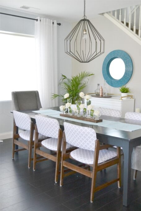
Don't be afraid to use your colors in unique ways like painting an accent wall or a painted piece of furniture. Once you define your palette and those colors are flowing throughout your home you'll have a connected and intentional look, even if other style elements varies.
Final Thoughts
My home is still a work in progress, but if I had to pick one thing that makes a home feel amazing and cohesive it's color.
A well-chosen whole house color palette will:
- Simplify your decorating decisions
- Create flow from one room to the next
- Reduce overwhelm
Whether you love bold colors or prefer calm neutrals, these steps will help you choose colors for your whole house with confidence.
For next steps, read this helpful guide: 👉 How To Choose Paint Colors + The Best Neutral Colors to Consider.


P.S. There's no better way to create a cohesive feel than with color, but in order to avoid mistakes and get an updated look you've got to understand color like a designer.
Inside my online course, Color Made Clear, I will teach you exactly what you need to know about selecting colors for your home in everything from paint colors, to flooring and carpet, to fabrics so you can make confident color decisions and get the exact look and feel you're going for. - Even if there are finishes in your home you can't change, I'll show you how to use color to distract from them for an updated look!
Frequently Asked Questions - Whole Home Color Palette
My colors don't flow from room to room. Help!
Creating a home that flows nicely from one room to another can definitely be challenging. Over the years I’ve worked hard to create a cohesive look in my home and I share my secrets with you in this post.
My walls are beige and sofa is grey; please help me pick colors for curtains and rug.
Since I can’t see your home in person, I can’t offer specific color/decor advice. Defining your home decor style will narrow your choices and make the process less overwhelming. This post I wrote will show you how to make your decorating choices much easier.
What are the paint names for your pictured color palette (5 color chips)?
Grey = Requisite Grey; Turquoise = Cooled Blue; Teal = Briny; Yellow = Eye Catching; and Pink = Heartfelt (all Sherwin Williams colors). You can find more details on my house paint colors here.
How do I mix different furniture wood tones with a color palette?
Keeping the undertones, grain or texture similar within a space is a good rule of thumb. Try to have each piece have a buddy in each space so it looks intentional and separate pieces that a different to reduce the impact. This post I wrote about mixing styles might be helpful for you too.
How much of each of the color types should I use?
The pro rule is a 60-30-10 ratio: 60% dominant color, 30% secondary color, and 10% accent color(s.) But I say do what feels good. Get your base down (wall color and trim) and then add in color until it feels just right. I like to add color around the room at different heights so that your eye naturally catches in different parts of the room.
I want to totally redo my house but don't know where to start.
Wall color is a great place to start and if you can afford to replace any of the staple items like a sofa, do that too. Once you have those in place it is just a matter of making items you already have work with your space. You can always change the color of something (like a large piece of furniture) with paint. Then add your pops of color a little bit at a time with things like pillows, curtains, and accessories.
How do I know if my wood cabinets will look good next to the color I chose?
Place your paint samples right up against the cabinets to be sure that the tones in the wood pair well with the wall color.
Is it okay to paint all the walls throughout just one neutral color? It feels like too much.
It's totally okay but if you feel like it is too much, you can do an accent wall in a color or even go up or down a shade of the neutral you already have to give a little contrast. Beyond that you can change it up from one room to the next with your accent colors. Maybe have the main accent color be different in each space while still incorporating the same color palette throughout.
