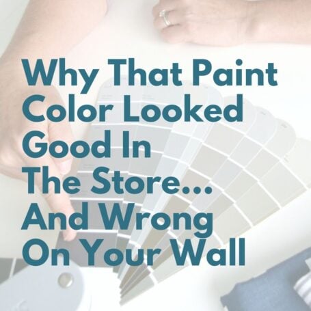
Sherwin Williams Pure White Paint Color Review
If you love the fresh look of white interior paint but feel overwhelmed by too many choices, let's narrow it down and focus on just one: Sherwin Williams Pure White (SW 7005).
White is a timeless paint choice that will never go out of style, but not all whites behave the same once they're on your walls. Some feel too stark, others too creamy, and many are surprisingly hard to coordinate. Pure White is one of those rare whites that works almost everywhere - and that's why it's so popular.
Homeowners and designers turn to Sherwin Williams Pure White again and again for walls, ceilings, doors, cabinets, and trim. Light and bright without feeling harsh, Pure White creates an organic modern style feel in any room.
Read on and find out what this amazing versatile paint color can do for your home.

In This Article:
Choosing paint color shouldn’t feel this hard.
If you’ve ever painted a room and thought, well… that looked better on the swatch, grab my free guide. I’ll show you the simple trick for spotting undertones before you paint.
What Color Is Pure White By Sherwin Williams?
Pure White is a bright, clean white which brings an air of freshness to any room. It's known for being extremely easy to coordinate with pretty much any color or style from traditional to contemporary and even rustic.
Because it's so neutral, Pure White works beautifully in open floor plans, homes with mixed finishes, and spaces where you want a consistent white throughout.
Pure White Sherwin Williams undertones
Undertones can be a spoiler - even for white paint - and tough to spot until the paint is already on your walls... yikes. (Read: How To Choose White Paint)
With Pure White (SW 7005) you don't have to worry about unpleasant paint surprises. One reason Pure White is so popular is the lack of tricky or glaring undertones. If pushed, it admits to a tiny drop of yellow and a hint of black in a very neutral base, which save it from appearing too cold or stark.
Never be fooled by sneaky undertones again! Know the trick to spotting them fast in neutral paint colors.
Is Sherwin Williams Pure White warm or cool?
This is where Sherwin William Pure White really shines. It's beautifully neutral - neither warm nor cool. That subtle drop of yellow undertone gives it just enough softness to feel welcoming without dipping into creamy territory.
Sherwin Williams Pure White LRV
If you've found my other Sherwin Williams white paint series posts, you'll remember that LRV (light reflective value) matters. It measures how much light a color reflects on a scale from 1 (blackest black) to 100 (true white).
Pure White Sherwin Williams LRV is 84 (bright, but not stark).
In south-facing rooms with warm natural light streaming in, Pure White's warmth will be a bit more noticeable. In north facing rooms, it still looks light and bright and will cheer up even small rooms with limited natural light.
Is Sherwin Williams Pure White too white?
Not at all. Pure White is a soft true white that's never too pushy or glaring. It works especially well if you want a clean, fresh look without committing to a trendy or stark white. It’s ideal for open floor plans, homes with mixed warm and cool finishes, and anyone who wants one white that can be used consistently on walls, trim, cabinets, and ceilings.
That said, if you're looking for a warmer, creamier white for your walls, colors like Sherwin Williams Alabaster or Greek Villa can feel more natural - especially in homes with lots of warm finishes, and beige, cream or golden tones.
You May Also Like


Sherwin Williams Pure White In Real Homes
The beauty of Pure White Sherwin Williams is that it's happy no matter where you use it - interior or exterior, walls or trim, cabinets or doors. if you love a spacious, airy environment, Pure White delivers.
If you prefer a moodier or more dramatic feel, consider exploring colors in the Sherwin Williams greige paint range instead.
Sherwin Williams Pure White exterior
Chelsee from House of Hood fell in love with Pure White's lack of undertones after seeing it in a model home and decided to incorporate it for their modern farmhouse. Paired with Tricorn Black (SW 6528) on doors and trim, it creates a bold, high-contrast look.
If the beachy, coastal vibe is more your style, Pure White captures it perfectly in this Florida home with a pool that says summer all year long.

Sherwin Williams Pure White walls
Many homeowners love using a canvas of Pure White as a neutral backdrop. It allows furniture, art, and decor to shine without competing for attention.
Pro Tip: When using the same shade for walls and trim, change the sheen to give it some dimension. For example, use flat or eggshell Pure White on walls and satin or semi-gloss Pure White on trim.
If you've ever dismissed white as boring, think again. Pure White looks stunning on ceilings, and it pairs beautifully with cabinet built-ins and accent colors like Smoky Candle (SW 8633).
Chelsey shows off her favorite all time white paint color - Pure White - which she used throughout her entire home including ceiling, walls, shiplap, cabinets, fireplace and trim! She says Pure White always looks great in every lighting condition!


Sherwin Williams Pure White kitchen cabinets
White kitchen cabinets with gold hardware are a classic combo and Pure White knocks it out of the park. So clean and classy, this kitchen pairs Pure White cabinets with a deep blue island in Anchors Away (SW 9179) for added punch.
(Photo shared from Instagram @michelleborgesi).

Sherwin Williams Pure White cabinets & built-ins
Pure White works beautifully on bathroom cabinets and office built-ins especially when paired with warm metals like brass or gold. The results feels polished, high-end, and timeless.

Sherwin Williams Pure White trim
Pure White is one of Sherwin William's most popular trim colors - and for good reason. Soak in the interior details of this elegant entry by Emily Henderson. The Pure White moulding, door, board and batten walls... triple wow! Notice the subtle offset wall color Oyster White (SW 7637).

Does Pure White Sherwin Williams work for exterior trim?
That's a firm yes.
This front porch painted Pure White has plenty of farmhouse appeal and invites us to just sit a while and chat with friends.
And a crispy coat of Pure White trim perked up this row brick home and turned it into the star of the block!


Sherwin Williams Pure White VS Other White Paint Colors
If you’re deciding between Pure White and other popular Sherwin Williams whites, here’s how they compare.
Snowbound vs Pure White
With an LRV of 83, Snowbound and Pure White are kissing cousins on the light reflectance scale. However, Snowbound can trickier in some lighting with its slightly taupe undertones.
Pure White is more predictably neutral which is why it's the more popular choice. Because there isn't enough contrast between them, they're not ideal to use together in the same room.

Pure White vs Extra White
Extra White (SW 7006) has an LRV of 86 and a noticeable bluish undertone. That dab of blue places it into the cool category so it feels sharper and less creamy than Pure White. Like Sherwin Williams Snowbound, you wouldn't want to pair these two together in the same room because they're too similar.

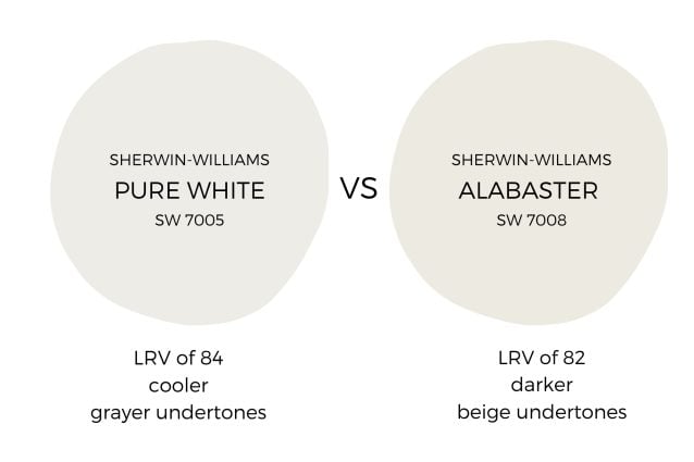
Pure White vs Alabaster
Sherwin Williams Pure White (LRV 84) and Sherwin Williams Alabaster (LRV of 82) are both true whites, rather than off-whites (off-whites dip below an LRV of 80).
Alabaster has stronger yellow-beige undertones which give it a cozier, softer feel. Many people opt for warm Sherwin Williams Alabaster walls with Pure White trim adding a beautiful layer of crispness.
High Reflective White vs Pure White
Sherwin Williams High Reflective White (LRV 93) is extremely bright - the heaviest hitter in the true white category. High Reflective White has a bluish undertone which makes it look too stark for walls but works well when you want high-contrast trim or cabinetry.
Due to those tiny drops of yellow and black, Pure White is a softer and more forgiving, making it the better choice for walls in most homes.

Making a paint choice can be hard and it's really easy to get lost in all the choices; I recommend getting a sample of SW Pure White paint to see how it will look with your lighting conditions and decor to take the guesswork out of your decision.
Looking to test paint colors but don't want to paint? Samplize offers peel and stick paint samples from all major paint brands delivered to your door so you can put them up on the wall with no mess.
SW Pure White Coordinating Colors
Pure White is an incredibly versatile paint color that can be paired with almost anything and look fabulous.
Pair it with deep grays and blacks for high-energy contrast and a modern feel. Colors like Tricorn Black (SW 6528) or Iron Ore (SW 7069) create bold definition against Pure White trim or cabinetry.
Final Thoughts
Choosing a white paint color can feel overwhelming, but Sherwin Williams Pure White is a dependable option that offers a clean, timeless look without the stress of strong undertones.
If you're trying to figure out how Pure White fits into the bigger picture of your home, be sure to read Easy Steps to Create a Whole House Color Palette for a simple, confidence-building approach to choosing colors.


P.S. There's no better way to create a cohesive feel than with color, but in order to avoid mistakes and get an updated look you've got to understand color like a designer.
Inside my online course, Color Made Clear, I will teach you exactly what you need to know about selecting colors for your home in everything from paint colors, to flooring and carpet, to fabrics so you can make confident color decisions and get the exact look and feel you're going for. - Even if there are finishes in your home you can't change, I'll show you how to use color to distract from them for an updated look!
