Sherwin Williams Neutral Ground Paint Color Review
Choosing the perfect neutral paint color can feel like a never-ending journey, right? You want something warm and inviting - but not too beige. Something that works with just about everything - but isn't, well… boring!
I know how overwhelming it can feel to pick a neutral shade that won’t wash out your walls or clash with your furniture.
That's exactly where Sherwin Williams Neutral Ground (SW 7568) comes in. It's a soft, creamy neutral that checks all the boxes for style, warmth and flexibility, and lets your personality shine.
Ready to take the leap into neutral territory? Let’s do this!

In This Article:
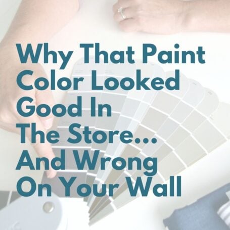
Choosing paint color shouldn’t feel this hard.
If you’ve ever painted a room and thought, well… that looked better on the swatch, grab my free guide. I’ll show you the simple trick for spotting undertones before you paint.
What Color Is Sherwin Williams Neutral Ground?
SW 7568 Neutral Ground is a warm off-white paint color that sits right in that sweet spot between beige and gray.
It’s not overly yellow, not overly gray - just a soft, balanced neutral that works beautifully across different rooms and home decor styles.
Think of it as:
- Warm without feeling heavy
- Light without feeling stark
- Neutral without feeling boring
SW Neutral Ground Undertones
Sherwin Williams calls the undertone khaki, but I like to keep things simple so let's just call it tan. 😉
That soft tan base has a breath of yellow warmth and a hint of green. All those warm tones combine to bring coziness without going full beige.
👉 Translation: it warms up a space without making it feel dated.
Neutral Ground LRV Explained
Neutral Ground has an LRV of 70, which means it reflects a good amount of light, keeping a room feeling light but not washed out. Generally the ideal LRV range for main living spaces is 65-75, so Neutral Ground sits squarely in that camp.
You don’t have to be an expert on Light Reflective Value (LRV) to understand how it affects paint color. You just need to know a few basic facts. (If you want more, head to Light Reflective Value In Paint – What Does It Mean?)
Heads up - lighting matters!
- In north-facing or darker rooms → it may look a bit more tan
- In bright natural light → it softens into a creamy neutral
👉 This is why testing is key. I strongly recommend picking up a few SW Neutral Ground paint samples and living with them a few days before making a paint choice.
Looking to test paint colors but don't want to paint? Samplize offers peel and stick paint samples from all major paint brands delivered to your door so you can put them up on the wall with no mess.
Sherwin Williams Neutral Ground Vs Other Popular Neutrals
Let’s dive into the ultimate neutral color showdown and find your perfect match!
SW Neutral Ground vs Accessible Beige
SW Neutral Ground is lighter and creamier, while SW Accessible Beige is darker and more gray-based.
- Choose Neutral Ground for bright, airy spaces
- Choose Accessible Beige for cozier, more grounded rooms

Sherwin Williams Neutral Ground vs Natural Choice
Sherwin Williams Natural Choice is slightly lighter and fresher, while Neutral Ground has more warmth. Natural Choice is great for open sunlit areas where you want a fresh, airy vibe. Neutral Ground's softer, warmer undertones make it perfect for cozy living spaces and bedrooms.

Sherwin Williams Neutral Ground vs Shoji White
Both paint colors are versatile neutrals, but SW Shoji White has a cooler, modern edge, while SW Neutral Ground is like a warm, creamy latte. Neutral Ground feels soft and cozy; Shoji White is brighter and perfect for sleek, airy spaces.

You May Also Like These Neutral Colors


Real Homes With Sherwin Williams Neutral Ground Color Palette
Now that we’ve talked up Sherwin Williams Neutral Ground, let’s see it in action in these real-life examples.
Neutral Ground exterior
Since Neutral Ground Sherwin Williams is less likely to look either too bright or washed out in sunlight, it's a smart pick for the exterior. It looks especially inviting on craftsman, traditional and modern farmhouse styles. This charming brick home marries Neutral Ground with SW Iron Ore trim.

Neutral Ground kitchen
Walls. ✅
Cabinets. ✅
Versatile Neutral Ground hits the right notes no matter where it's asked to perform. Try it out on kitchen walls with SW Greek Villa on the cabinets and SW Iron Ore on the island. Or flip the script and put SW Neutral Ground on the cabinets and Greek Villa on the walls. Either way, Neutral Ground is a terrific choice for your kitchen.


SW Neutral Ground walls (whole home use)
You’ll definitely want to consider Neutral Ground as the star of your whole house color palette. Unlike bold black paint accent colors and moody blue gray paint blends we've chatted about, this neutral beauty can work its magic throughout your home, anywhere, anyhow. It has enough depth to feel intentional but is neutral enough to let your decor shine.
Let's explore some of the ways people have successfully used Neutral Ground on their walls.
Neutral Ground office
In this modern home office Neutral Ground feels like a warm hug for your workspace. It sets the perfect tone for productivity, creating a serene backdrop for this sleek and stylish decor. Trim and ceiling SW Extra White.

Dining room SW Neutral Ground

Bye-bye boring beige. This modern dining room mixes cozy shades of beige and brown to create a warm, stylish eating area. With SW Neutral Ground as the perfect backdrop, it's anything but dull!
Sherwin-Williams Neutral Ground bedroom
SW Neutral Ground creates a soft, tone-on-tone look on walls and ceiling that feels calm and relaxing, while SW Cayenne adds a bold splash of spice on the accent wall. Talk about the perfect blend of chill and thrill!

Neutral Ground SW Entry

Joy at @buildingacasehouse created a chic board and batten effect in her entryway by adding wood lattices to the walls. I'm loving the natural, traditional feel it brings and SW Neutral Ground looks amazing with the dark wood door and flooring.
Living room Neutral Ground Sherwin Williams
Neutral Ground walls set a warm and welcoming tone in this cozy conversation nook. It’s the perfect spot to kick back with a friend and sip some wine!

Neutral Ground wainscoting and soaring high ceilings give this formal living room a warm, inviting vibe. Throw in a luxurious velvet sofa, and you've got yourself a spacious haven that's begging for relaxation.

You May Also Like


Sherwin Williams Neutral Ground Coordinating Colors
Coordinating colors with a versatile paint color like Sherwin Williams Neutral Ground is a breeze.
- For a soft, calming green, pair it with SW Sea Salt
- Feeling bolder? Go for SW Iron Ore for dramatic contrast.
- Keep it fresh and light with SW Alabaster
Final Thoughts: Why SW Neutral Ground Works So Well
One of the biggest reasons Neutral Ground is so popular right now is because it bridges the gap between gray and beige trends.
A lot of homes today already have:
- Warm wood floors
- Beige tile or countertops
- Mixed metal finishes
Cool grays can fight with those elements but Neutral Ground blends instead of battles.
👉 It’s a great choice if you want a whole house neutral that works with what you already have instead of forcing you to start over.
Ready To Take It A Step Further?
Choosing one paint color is a great start but the real magic happens when everything flows together.
If you want your home to feel cohesive from room to room, check out this next step:
👉 Easy Steps to Create a Whole House Color Palette
It’ll walk you through how to take a color like Neutral Ground and build a full palette around it so your home finally feels pulled together (without second-guessing every choice).


P.S. There's no better way to create a cohesive feel than with color, but in order to avoid mistakes and get an updated look you've got to understand color like a designer.
Inside my online course, Color Made Clear, I will teach you exactly what you need to know about selecting colors for your home in everything from paint colors, to flooring and carpet, to fabrics so you can make confident color decisions and get the exact look and feel you're going for. - Even if there are finishes in your home you can't change, I'll show you how to use color to distract from them for an updated look!
