Best Gray Green Paint Colors For Your Home
Gray green paint colors are becoming an increasingly popular way to style with neutrals and yet introduce soft color to your home.
Homeowners everywhere are discovering that blending green and gray together creates a variety of restorative shades that transform the ambience of any room.
In this article, let's take a look at some of the best green gray paint colors by Sherwin Williams, and you may just find the perfect shade you've been searching for.

In This Post:
Choosing paint color shouldn’t feel this hard.
If you’ve ever painted a room and thought, well… that looked better on the swatch, grab my free guide. I’ll show you the simple trick for spotting undertones before you paint.
What Is A Gray Green Paint Color?
The definition of a gray green paint color is quite simply any color where green has gray undertones... or where gray paint has green undertones. By itself, green is a warm, positive color, evoking freshness and natural vitality. Gray is cool, balanced, and calm. Blending them together results in a refreshing, calming neutral that is never dull or cold.
How To Choose Gray Green Paint
The two main things to consider when selecting any paint color for your whole house color palette are:
- Light Reflectance Value (LRV) will tell you how much light a color absorbs and how much light it will bounce around a room. The LRV scale goes from 1 being the darkest (black) and 100 being the lightest (white).
- The undertones which are often tricky and hidden until you get the room painted which is why it's so important to test your colors first.
Looking to test paint colors but don't want to paint? Samplize offers peel and stick paint samples from all major paint brands delivered to your door so you can put them up on the wall with no mess.
Popular Gray Green Paint Colors
To keep things simple, I've organized the list of best neutral green gray paint colors from the lightest to the darkest shades.
Light green gray paint colors
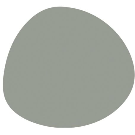
Sea Salt SW 6204

Sherwin Williams Sea Salt is a calming neutral often described as a soft, muted greenish-blue with a beachy vibe.
Sea Salt SW is one of those lovely chameleon green colors that shift and bend among green, blue and gray throughout the day.
It's best used in small areas like a bathroom when you want a wash of color for a bright and airy feel.
Chelsee from House of Hood created a light and airy bedroom refuge with Sea Salt featured on a board and batten accent wall behind the bed. The wall and trim color is Sherwin Williams Pure White, which is perfectly set off with SW Sea Salt for that modern coastal style.

Comfort Gray SW 6205

Comfort Gray SW 6205 is a quietly sophisticated mix of green, blue and gray that walks on the cool side of the street.
This light neutral paint is ideal as a beautiful calming primary wall color for your whole house color palette yet is strong enough to hold up outdoors as an exterior siding choice without looking washed out in the sun.
If your room has less light or faces North, Comfort Gray may appear a cool blue or gray. More sunlight or a southern exposure will emphasize the warmer green side.
This laundry room with Comfort Gray walls feels so fresh and clean, exactly how a laundry room should feel.

Oyster Bay SW 6206

Sherwin Williams Oyster Bay paint is a soft neutral green paint that leans to the cool side due to a significant dollop of blue gray.
SW Oyster Bay is a darker, deeper version of SW Sea Salt and is suitable for most decor styles, particularly chic coastal, traditional, Scandinavian and modern farmhouse.
In a room with lots of light, Oyster Bay has that fascinating ability to shift colors throughout the day.
This gently bright and relaxing living room features Oyster Bay walls which makes the atmosphere feel natural and friendly. The walls create a lovely color balance for all the white elements and adds spaciousness to the room.

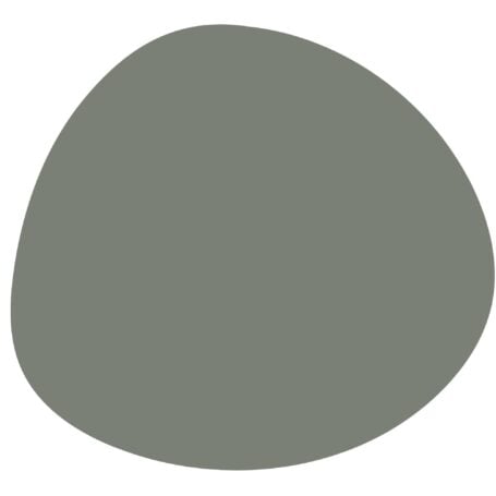
Acacia Haze SW 9132
Sherwin Williams Acacia Haze is a soft, mid-toned green-gray that's slightly darker and grayer than Oyster Bay.
Its slate-gray undertones give it a cool, sophisticated feel, though it can appear warmer in bright, direct light. This versatile shade shifts between green, gray, and blue depending on lighting, making it a true chameleon color.
Commonly used on exteriors, cabinetry, and accent walls, Acacia Haze adds a tranquil yet refined touch to any space.
If you love a green accent wall, Acacia Haze SW adds just the right touch of muted green elegance, especially when paired with simple, modern decor.

Dark gray green paint colors
Evergreen Fog SW 9130

Evergreen Fog Sherwin Williams is a serene, green gray neutral. In 2022 it was named Sherwin Williams' color of the year and continues to be a popular choice.
The green brings in nature and a sense of outdoor living, while the gray grounds the color and keeps it from being overwhelming.
SW Evergreen Fog is most likely to be found on wainscoting, accent walls, cabinetry, stairways, shelves, interior doors, and even painted furniture.
Caitlin Higgins transformed a long dark hallway by creating a gallery wall and using Evergreen Fog SW as the perfect backdrop to showcase it all.

Retreat SW 6207
Noticeably darker than Evergreen Fog, Sherwin Williams Retreat is a cool-leaning sage green-gray that feels perfectly named for creating a peaceful retreat-like space.
Its balanced mix of green and gray undertones shifts beautifully with the light, appearing cooler and grayer in low-light rooms and warmer, more natural in sunlight.
While a bit too dark for whole-home use, Retreat shines on cabinetry, accent walls, and cozy bedrooms where you want a grounded yet serene atmosphere.
Retreat green gets along with nearly any metal finish and brings a modern yet calming feel to these cabinets, adding depth and sophistication without being overwhelming.

Rosemary SW 6187

SW Rosemary's warm organic green hue has a depth and moodiness perfect for making a dramatic statement on shiplap walls, board & batten accent walls and wood cabinetry.
Its muted foresty ambience brings the outdoors inside and works just as well for a traditional home decor style as for modern and farmhouse styles.
Many people who shy away from going all in with black paint colors turn to a deep shade like Rosemary green to achieve similar visual impact.
Nicole from Basic Blue House created a stunning focal point by incorporating a vibrant Rosemary green kitchen island into a basic white kitchen. The green island pops against the white cabinets and looks both trendy and timeless.

Pewter Green SW 6208
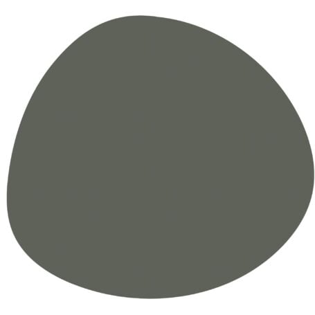
Sherwin Williams Pewter Green is a rich, dark green with cool gray undertones that give it a dark forest tone.
Its depth adds bold character to cabinetry, accent walls, and exteriors.
With an LRV of 12, this cozy, light-absorbing shade shifts subtly throughout the day, appearing grayer in low light and warmer green in bright, sunlit spaces, so always test it first to see how it behaves in your home.
Renee of Renee Renovates names Pewter Green as one of her clients' top exterior colors because its depth and moody appearance is perfect for the modern cabin style.

Ripe Olive SW 6209

Ripe Olive Sherwin Williams is a deep, highly saturated green perfect for making a bold statement on accent walls and cabinetry.
Ripe Olive takes its deep green inspiration from nature, and feels earthy and soothing rather than neon bright and jarring.
This soothing quality makes SW Ripe Olive paint a trendy yet timeless choice for nearly every room and even on the exterior.
This modern office features Ripe Olive Sherwin Williams walls and shelving working together seamlessly with simple neutral furnishings for a streamlined look. The gold metal lighting and vase provide a touch of glam.

You May Also Like


P.S. There's no better way to create a cohesive feel than with color, but in order to avoid mistakes and get an updated look you've got to understand color like a designer.
Inside my online course, Color Made Clear, I will teach you exactly what you need to know about selecting colors for your home in everything from paint colors, to flooring and carpet, to fabrics so you can make confident color decisions and get the exact look and feel you're going for. - Even if there are finishes in your home you can't change, I'll show you how to use color to distract from them for an updated look!
