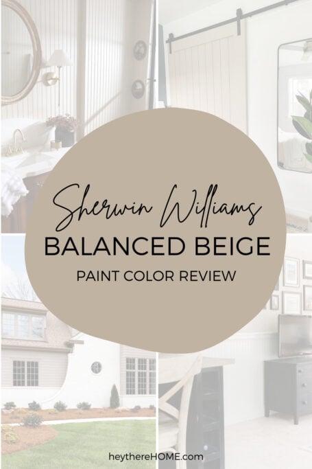
Sherwin Williams Balanced Beige: Is Beige Back?
Choosing the right neutral paint color can feel like walking a tightrope over a sea of paint swatches. One wrong step, and you're living with a wall that’s too yellow, too dark, or just plain wrong.
Enter Sherwin Williams Balanced Beige, a neutral powerhouse that’s here to rescue you from repainting misery. Let’s dive into everything you need to know about this versatile shade so you can confidently decide if it’s the right fit for your home - the first time.

Choosing paint color shouldn’t feel this hard.
If you’ve ever painted a room and thought, well… that looked better on the swatch, grab my free guide. I’ll show you the simple trick for spotting undertones before you paint.
Table of Contents
What Color Is Sherwin Williams Balanced Beige?
Sherwin Williams Balanced Beige SW 7037 is exactly what its name suggests: a beautifully balanced, warm neutral. It’s a beige that doesn’t veer too far into yellow or orange territory, nor does it have the overly cool gray undertones that have dominated paint trends in recent years. It’s a grounding color that feels earthy yet sophisticated.
While Sherwin Williams Balanced Beige shines as a primary wall color, it also works in other applications:
- Cabinets: It’s not the first choice for cabinets, as it may feel too mid-tone and blend into the background. Opt for a lighter or darker neutral for cabinets.
- Trim: Balanced Beige can be used as trim in spaces where you want a monochromatic, seamless look, but it’s better suited for walls.
- Accent Walls: It’s subtle but effective for accent walls, especially in bedrooms or living rooms where you want a cohesive look without high contrast.
What are the undertones of Balanced Beige Sherwin Williams?
Undertones can make or break a paint color, and SW Balanced Beige plays it cool (and warm…). This shade leans slightly warm but carries subtle taupe and greige undertones, giving it a balanced (pun intended!) vibe. These undertones make it an excellent choice for homeowners looking for a neutral that doesn’t feel too stark or cold but also avoids looking overly creamy.
In spaces with ample natural light, you’ll notice the taupe undertones emerge, creating a soft and elegant look. In darker spaces, the warmth in Balanced Beige Sherwin Williams keeps it from feeling too heavy or muddy.
What Is the LRV of Sherwin Williams Balanced Beige?
LRV, or Light Reflectance Value, measures how much light a color reflects. Balanced Beige has an LRV of 46, putting it smack in the middle of the scale. It’s not too light, not too dark - the Goldilocks of neutral paint colors. This makes it an excellent option for creating a cozy atmosphere without feeling oppressive.
Lighting can make any paint color feel like it has a split personality. Here’s what to expect from Balanced Beige:
- Natural Light: In rooms with lots of sunlight, Balanced Beige looks soft and sophisticated. The greige undertones shine through, and the color takes on a modern, airy feel.
- Artificial Light: Under warm artificial lighting, the beige tones feel cozier and more pronounced, making it a great choice for living rooms or bedrooms.
- North-Facing Rooms: These spaces tend to have cooler, bluish light, which can bring out the taupe and gray undertones in Balanced Beige, giving it a more subdued appearance.
- South-Facing Rooms: The warm light in south-facing rooms will amplify the beige warmth, creating an inviting and sunny look.
Before committing, it’s essential to try a sample of SW Balanced Beige on your wall to see how it behaves in your unique lighting.
Looking to test paint colors but don't want to paint? Samplize offers peel and stick paint samples from all major paint brands delivered to your door so you can put them up on the wall with no mess.
You May Also Like


SW Balanced Beige Vs Other Neutral Paint Colors
Choosing the perfect neutral paint color can feel like speed dating - so many options, and they all look almost right! In this section, we’re putting Sherwin Williams Balanced Beige in the hot seat, comparing it to three other fabulous neutrals to help you see how it stacks up. Whether you’re drawn to warm and cozy vibes or something a little cooler and fresher, these comparisons will help you find your match made in paint heaven!
Sherwin Williams Balanced Beige vs Accessible Beige
Balanced Beige SW brings the drama with its deeper LRV of 46, while Accessible Beige SW keeps things lighter and brighter at 58. The taupe undertones in Balanced Beige lean warmly into brown, creating a cozy richness, while Accessible Beige stays soft and versatile with warm taupe and a whisper of gray. If you’re craving a fresh and airy feel, Accessible Beige delivers, but for a snug, grounded vibe, Balanced Beige is your go-to neutral.

Sherwin Williams Balanced Beige vs Natural Linen
SW Balanced Beige turns up the depth with its LRV of 46, while SW Natural Linen keeps it breezy and bright with an LRV of 66. Balanced Beige’s warm taupe undertones create a grounded, cozy vibe, whereas Natural Linen brings a soft beige base with a sunny touch of yellow-cream. If you want a snug, inviting feel, Balanced Beige is your star.

Sherwin Williams Balanced Beige vs Loggia
Balanced Beige and Loggia are close in depth, with LRVs of 46 and 48, but their personalities couldn’t be more different. Sherwin Williams Balanced Beige leans into warm, toasty taupe with rich brown undertones, while Sherwin Williams Loggia takes a cooler approach with its greige base and soft green undertones. For a sleek, slightly cooler edge, Loggia is the one to call, but if you prefer cozy and invited, Balanced Beige is the perfect pick.

You May Also Like


A Closer Look - SW Balanced Beige In Real Spaces
Sometimes, seeing is believing. Let’s take a peek at how Sherwin Williams Balanced Beige looks in real-life spaces, both inside and out, and find out why this warm, earthy neutral is a fan favorite!
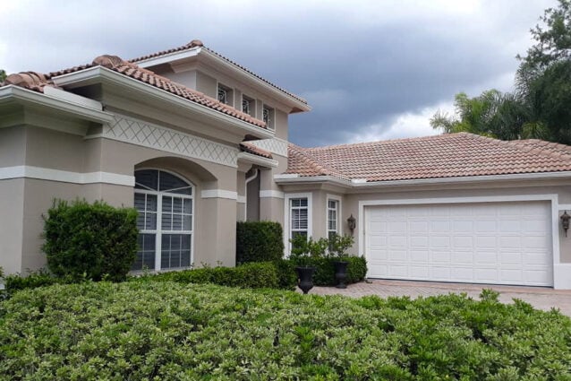
Sherwin William Balanced Beige exterior
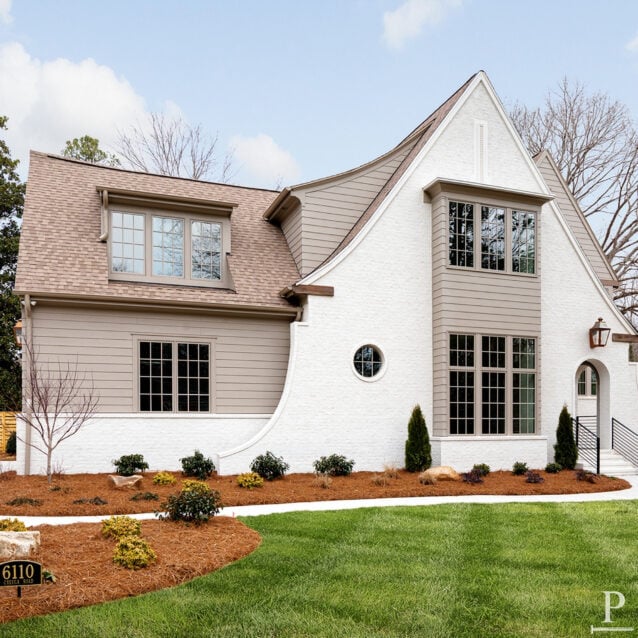
Sherwin Williams Balanced Beige takes center stage on this white brick beauty, adding just the right amount of warmth and contrast to the accent siding. The soft, earthy tone feels like a perfectly tailored jacket for the crisp white brick, pulling the whole look together effortlessly.
This home takes Balanced Beige a step further as the primary exterior color for a warm, grounded feel that’s both inviting and timeless. Paired with SW Aesthetic White trim, the contrast is subtle yet sophisticated, like a perfect pairing of latte and cream.
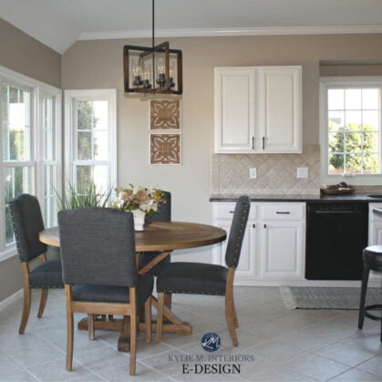
Balanced Beige kitchen
Balanced Beige Sherwin-Williams proves its versatility in these kitchens on both walls and cabinets. As a wall color, it adds a warm, sophisticated backdrop that perfectly balances light and dark finishes. On the cabinets, it’s a cozy, grounding hue that pairs beautifully with brass accents, wood tones, and even modern touches.

Balanced Beige Sherwin-Williams walls
Who doesn't love a gallery wall? Sherwin Williams Balanced Beige sets the stage perfectly, offering a warm and calming backdrop that lets the artwork shine. Paired with Sherwin Williams Accessible Beige on the wainscoting below, they create a light, inviting vibe in this sunroom, making it the perfect spot to kick back and soak up some rays.

Balance Beige Sherwin Williams walls wraps this master bedroom in a warm, serene hug, creating the perfect retreat from the chaos of daily life. The earthy undertones play beautifully with the soft textiles and neutral decor, making the space feel cozy yet sophisticated.
Light and life stream into this living room space, complemented by the soft neutrals of SW Balanced Beige creating a warm and inviting atmosphere. Paired with creamy furniture, earthy accents, and subtle textures, this beige becomes the perfect backdrop for a serene yet stylish setting.


SW Balanced Beige accent walls
Modern barn doors are a popular design choice and SW Balanced Beige shows off in this stylish master bedroom retreat. Its creamy beige tone harmonizes effortlessly with the crisp white walls and dark hardware, making the door both a functional and stylish centerpiece. The cozy hue subtly grounds the space, adding just the right amount of depth.

Sherwin Williams Balanced Beige adds timeless charm to the narrow shiplap in this elegant bathroom, softly highlighting its texture with a warm, creamy hue. The neutral tone perfectly balances the vintage richness of the wooden vanity and the sleek contrast of black-framed shower doors.

Sherwin Williams Balanced Beige Color Palette Ideas
Balanced Beige plays well with others, making it easy to create a cohesive color palette. Here are some coordinating colors to consider:
- Sherwin Williams Accessible Beige (SW 7036): A lighter beige for trim or adjacent spaces.
- Sherwin Williams Urbane Bronze (SW 7048): A deep, moody accent color that pairs beautifully with Balanced Beige.
- Sherwin Williams Alabaster (SW 7008): A soft, warm white for ceilings, trim, or cabinets.
- Sherwin Williams Sea Salt (SW 6204): A serene green-gray that adds a pop of freshness.
Home Color Palette Idea:
- Walls: Balanced Beige
- Trim: Pure White
- Accent Wall: Gauntlet Gray
- Pop of Color: Riverway (decor or furniture accents)
The Bottom Line: Should You Choose SW Balanced Beige?
If you’re looking for a neutral that’s warm without being yellow, versatile without being boring, and sophisticated without being stuffy, Sherwin Williams Balanced Beige might just be your perfect match. It’s a safe choice for those who want a paint color that’s stylish yet timeless, and its balanced undertones make it forgiving in a variety of lighting situations.
So, skip the repainting headache and grab a sample of Balanced Beige. With this shade, you’re one step closer to achieving the beautifully cohesive home of your dreams!


P.S. There's no better way to create a cohesive feel than with color, but in order to avoid mistakes and get an updated look you've got to understand color like a designer.
Inside my online course, Color Made Clear, I will teach you exactly what you need to know about selecting colors for your home in everything from paint colors, to flooring and carpet, to fabrics so you can make confident color decisions and get the exact look and feel you're going for. - Even if there are finishes in your home you can't change, I'll show you how to use color to distract from them for an updated look!
