Sherwin Williams On The Rocks: The Neutral Paint Color That Goes With Everything
Choosing the perfect neutral paint color can feel like searching for a needle in a haystack… made entirely of gray paint swatches. But what if I told you there’s a beautiful, versatile neutral that can help you decorate with confidence - and nail your perfect color the first time?
Sherwin Williams On The Rocks SW 7671 has become a go-to modern neutral for homeowners, designers, and DIYers alike. Whether you’re sprucing up your living room, updating kitchen cabinets, or painting your exterior, On The Rocks is about to become your new favorite friend.
Ready for the ultimate review of Sherwin Williams On The Rocks? Let’s dive in!

In This Article
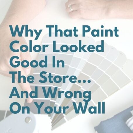
Choosing paint color shouldn’t feel this hard.
If you’ve ever painted a room and thought, well… that looked better on the swatch, grab my free guide. I’ll show you the simple trick for spotting undertones before you paint.
What Color Is Sherwin Williams On The Rocks?
Before we get into the nitty gritty of light reflection and undertones, let’s start with a simple description. Sherwin Williams On The Rocks (SW 7671) is a bright gray paint color in the white family. It’s fresh and neat, and it’s just warm enough to feel comfortable without straying too far into greige.
While some grays feel cold, stormy, or blue-ish, On The Rocks by Sherwin Williams has a subtle warmth that keeps it feeling soft and neutral. Think of it like the perfect light gray t-shirt that goes with absolutely everything.
On The Rocks Sherwin Williams undertones
One of the biggest frustrations with gray paint colors is dealing with unexpected undertones (hello, green or purple walls that no one saw coming!).
On The Rocks has soft, slight warm undertones with a hint of taupe.
- It leans warm in most lighting situations without tipping into greige territory.
- You won’t find surprise blue or green undertones, which makes it feel less risky.
- In rooms with lots of natural light, the undertones stay true to color and don't wash out.
Bottom line: If you want a light gray without surprises, SW On The Rocks is a safe bet.
What is the LRV of SW On The Rocks?
LRV stands for Light Reflectance Value, and it’s a scale from 0-100 that tells us how light or dark a color is with 0 = blackest black and 100 = whitest white. (No paint colors are actually a total zero or 100!)
Sherwin-Williams On The Rocks has an LRV of 62.
Translated this means:
- It reflects a better than average amount of light.
- In rooms without much natural light, it won’t feel dingy or muddy.
- In brighter rooms, it will reflect natural light around the room but still have enough depth to retain its color.
Pro tip: Always test Sherwin Williams On The Rocks in your space before committing. The lighting, furniture, and surrounding finishes will impact how it reads.
Looking to test paint colors but don't want to paint? Samplize offers peel and stick paint samples from all major paint brands delivered to your door so you can put them up on the wall with no mess.
SW On The Rocks Vs Other Neutral Paint Colors
On The Rocks vs Agreeable Gray
SW Agreeable Gray is warmer, cozier, and has more beige undertones compared to the cooler, crisper, and more neutral On The Rocks. It has a slightly lower LRV, making it feel deeper and softer, while On The Rocks reflects more light and feels brighter. Overall, Agreeable Gray leans warm and approachable, while On The Rocks reads cooler and more modern.

On The Rocks vs Crushed Ice
Sherwin Williams Crushed Ice and Sherwin Williams On The Rocks are both lovely light gray paint colors. Crushed Ice is a breath lighter and leans very slightly warm while On The Rocks feels a touch darker and cooler in a room. The choice will depend whether you prefer a slightly warmer or cooler look and how much natural light your room gets.

On The Rocks vs Light French Gray
Light French Gray is darker, cooler, and has a hint of blue undertone. It’s more of a true, crisp gray. On The Rocks paint color is lighter and softer, leaning ever so slightly warm. The choice between the two will depend on whether you want a stronger gray tone (Light French Gray) or a lighter and more versatile neutral (On The Rocks).

You May Also Like These Neutral Colors


A Closer Look: On The Rocks Paint Color in Real Spaces
Sometimes, seeing is believing. Let’s take a peek at how Sherwin Williams On The Rocks looks in real-life spaces - both inside and out. From cozy living rooms bathed in natural light to stunning exterior facades, you’ll see why this light gray is a fan favorite. Prepare to be inspired - and maybe even start planning your next paint project!
Sherwin Williams On The Rocks exterior
On The Rocks gives this home’s exterior a clean, soft, and sophisticated vibe, balancing beautifully between a light gray and soft greige that feels timeless and modern. Paired with SW High Reflective White trim, the ledge stone details pop, while On The Rocks adds just the right amount of depth, preventing it from looking too flat or washed out in natural light.

Sherwin Williams On The Rocks interior walls
Let’s take a peek at some stunning wall spaces where On The Rocks shines, proving that the perfect neutral doesn’t have to be boring - it can be downright dreamy.
On The Rocks entryway

On The Rocks Sherwin Williams sets the stage in this entryway with its soft, airy gray that feels chic and perfectly neutral. It creates a clean, calming backdrop that lets the gold mirror, rustic console, and playful textures - like those furry stools - really pop. The result? A welcoming, stylish space that feels polished but still warm.
SW On The Rocks powder room
Sherwin Williams On The Rocks makes this vintage-inspired powder room feel fresh, clean, and modern. On The Rocks is the perfect sophisticated backdrop that allows the mirror, mixed metal fixtures, and patterned tiles to shine.
PS: Check out how I achieved a similar pattern tile look by painting vinyl floors in my laundry room!

On The Rocks office
Sherwin-Williams On The Rocks gives this home office by Kelley Nan a serene, polished vibe with its soft, light gray tone that’s both calming and sophisticated. Against the SW Creamy built-ins, it strikes the perfect balance - cool and crisp without feeling stark - letting the gold accents and decor truly sparkle.

On The Rocks bedroom
Looking for a serene retreat perfect for relaxing? On The Rocks Sherwin Williams has got you covered, imbuing this bedroom with a soft, airy gray that feels like a gentle hug. I love how the dark gray bedding and purple accents provide contrast and depth without feeling jarring or out of place.

Dining room On The Rocks Sherwin Williams
SW On The Rocks brings a fresh vibe to this dining room, creating the perfect soft gray backdrop for the mix of warm wood tones and textured rug. This color truly plays nice with natural light, giving the space a relaxed, understated charm.

Living room On The Rocks Sherwin Williams
SW On The Rocks gives this living room a fresh and relaxing, making it the perfect backdrop for the cozy neutrals, soft whites, and natural wood tones.

SW On The Rocks cabinets and doors
On The Rocks gives this long bathroom vanity a clean, spa-like vibe with its soft, light gray hue creating a soft, timeless look without feeling stark.
And while I personally love crisp white trim (like SW Pure White), On The Rocks can work as a modern, light-gray option for interior doors and trim that elevates the look of your home, like this pantry door (walls: SW City Loft; trim: SW Extra White).


Sherwin Williams On The Rocks Coordinating Colors + Home Color Palette Ideas
If you’re wondering what to pair with Sherwin Williams On The Rocks, here are some winning combos:
- Trim + Accent Colors:
- Sherwin Williams Pure White (SW 7005): Crisp, clean white trim.
- Sherwin Williams Peppercorn (SW 7674): A deep, moody charcoal.
- Whole Home Palette Idea:
- Walls: On The Rocks (SW 7671)
- Trim: Pure White (SW 7005)
- Accent Walls: Peppercorn (SW 7674)
- Cabinets: Light French Gray (SW 0055)
This combination creates a modern, sophisticated look that flows cohesively throughout your home.
Is Sherwin-Williams On The Rocks The Right Paint Color For You?
If you’re looking for a light gray that’s versatile, neutral, and plays nice with almost any style… Sherwin Williams On The Rocks might just be your perfect match.
It’s warm without being beige, light without being stark, and modern without feeling cold. Plus, with its predictable undertones, it’s a choice you can feel confident about.
So say goodbye to overwhelm and paint swatch paralysis. With On The Rocks paint color, you’re one step closer to the home you love - one brushstroke at a time.
Ready to take the plunge? Go grab a sample and start testing SW On The Rocks in your space!


P.S. There's no better way to create a cohesive feel than with color, but in order to avoid mistakes and get an updated look you've got to understand color like a designer.
Inside my online course, Color Made Clear, I will teach you exactly what you need to know about selecting colors for your home in everything from paint colors, to flooring and carpet, to fabrics so you can make confident color decisions and get the exact look and feel you're going for. - Even if there are finishes in your home you can't change, I'll show you how to use color to distract from them for an updated look!
