Sherwin Williams Upward 6239 – 2024 Color Of The Year
While warm neutrals will always be a popular paint choice, there's been a shift in interest to lighter, brighter shades of blue gray paint to go along with a growing trend toward a casual coastal design style.
In recognition of this significant shift, Upward SW 6239 was chosen as the Sherwin Williams 2024 Color of the Year.
If the coastal vibe isn't your thing - no worries - because Sherwin Williams Upward looks fabulous in a variety of home design styles including traditional, modern, and farmhouse and can be effortlessly paired with numerous colors, especially dark woods and various metal finishes.
So let's take a closer look at this peaceful blue and discover whether it's the right blue gray paint color for your home.

In This Article:
Choosing paint color shouldn’t feel this hard.
If you’ve ever painted a room and thought, well… that looked better on the swatch, grab my free guide. I’ll show you the simple trick for spotting undertones before you paint.
What Color Is Upward Sherwin Williams? Gray Or Blue?
SW Upward paint is a medium neutral; a calming shade of soft blue that brings a sense of serenity and harmony to any room. It leans more into blue than the other blue gray paint colors we've been exploring, like Sherwin Williams Stardew and Sherwin Williams North Star.
Upward paint is also balanced between being a warm and cool color. Regardless of whether your room faces north or south, or gets a lot of light or doesn't, Upward will hold its hue very well.
What are Sherwin-Williams Upward undertones?
SW Upward has cool gray undertones which save it from being a "baby blue nursery" pastel. It also has a drop of violet.
If you're concerned about your room looking too purple, be sure to sample Sherwin Williams Upward on your walls so you can view it in a variety of lighting conditions before committing. Don't skip this step; it can save you a ton of paint grief!
Looking to test paint colors but don't want to paint? Samplize offers peel and stick paint samples from all major paint brands delivered to your door so you can put them up on the wall with no mess.
What is LRV of Sherwin Williams Upward?
The LRV of Upward by Sherwin Williams is 57 which puts it right at mid-range, neither too dark nor too bright.
The Light Reflectance Value, or LRV, measures how much light a paint color reflects or absorbs on a scale from 1-100 with 1 = absolute black (absorbs all light) and 100 = purest white (reflects all light).
Knowing the LRV of a paint color helps you predict how the paint color will react to the lighting conditions in your room. The higher the LRV, the more the paint will bounce back, or reflect, existing light. A darker LRV paint color can make your room appear smaller.
Sherwin-Williams Upward Vs Other Blue Gray Paint Colors
All the blue gray neutral paints can look stunning in a room; the gray undertones will keep the blue from being overpowering and give it a more sophisticated feel. It's really hard to pick a favorite, though, so it really comes down to how you want your home to feel, and what the other room elements are.
(**If you want to know what neutral colors I picked for my own home, I reveal them here.)
Sherwin Williams Upward vs Krypton
SW Upward is lighter and bluer than Krypton SW 6247, which is more halfway between gray and blue. Krypton is a great go-to, though, and both colors can work equally well in a variety of settings. Pair either of them with true white trim colors like Sherwin Williams High Reflective White or Sherwin Williams Extra White.

Sherwin Williams Upward vs North Star
When you compare SW Upward with North Star Sherwin Williams, you'll see North Star is cooler and crisper blue gray than Upward and is a more subtle backdrop in a room. Use Upward paint if your goal is to add more color and interest; choose SW North Star if you want less color and a more subdued backdrop.

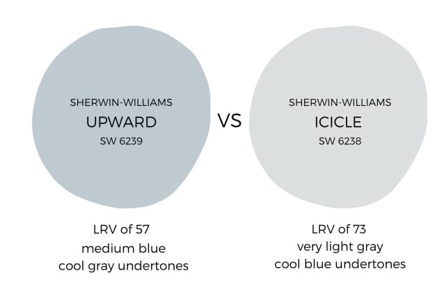
Sherwin Williams Upward vs Icicle
Icicle SW 6238 is on the same color strip as SW Upward, and it's one full shade lighter. Upward paint is warmer and more inviting than Icicle (think denims vs formal attire!), but Icicle is more restful and understated. Icicle paint is quiet enough to be a primary neutral throughout; Upward paint is strong enough to be used as an accent wall or in a single room but be careful about using it throughout unless you're going for a coastal theme.
(In the room examples below, see how Icicle and Upward team up to create a meditative, relaxing bedroom.)
You May Also Like


Photos of Rooms With Sherwin Williams Upward Color Palette
SW Upward entry walls
This entry in Ann's home On Sutton Place is a welcoming breath of fresh air. The contrast with the white trim and the dark wood makes Upward look particularly blue here.

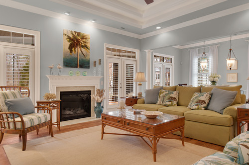
SW Upward family room
Say yes to the beach theme in this South Carolina home by Ask Amy Interior Design. Upward and coastal design is a match made in heaven, with Upward providing the backdrop for coastal accents in the pillows, pictures and accessories.
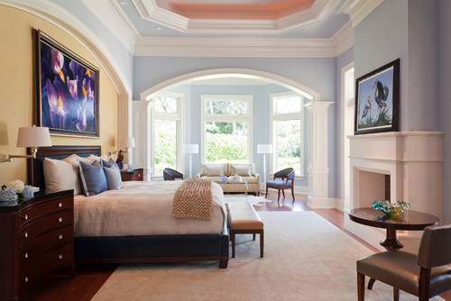
Sherwin Williams Upward bedroom
The bedroom is the optimal place for bringing in tranquility with Upward paint color on the walls, as these next examples illustrate. This room is a lovely sanctuary to settle in with a book for a quiet, meditative evening. Sherwin Williams Icicle 6238 is on the ceiling.

Modern Florida Home says they've been using Upward paint color in clients' bedrooms for years to soothe and refresh tired minds, like this guest bedroom.

And in this traditional style bedroom by Harwick Homes, SW Upward on the walls is paired with Sherwin Williams Creamy 7012 on the trim (the accent wall behind the headboard isn't paint; it's a silk hanging). I love everything about this captivating room.
Sherwin Williams Upward kitchen
The camera definitely didn't pick up the blue in these Upward kitchen cabinets in this dream "his and her kitchen" remodel by Dura Supreme Cabinetry. Pairing SW Upward with white trim and tile and gray countertops makes for an inviting, calm kitchen.

Sherwin Williams describes Upward in this kitchen as a "breezy, blissful blue". It contrasts beautifully with the wood tones and other white/gray elements, making this a light and fresh space to enjoy meal prep.

Blue gray paints have become really popular in places where relaxation is important, especially bedrooms, living areas, and bathrooms.
While I wouldn't rule out Sherwin Williams Upward paint color from consideration as an exterior paint, be sure to consider other factors like your exterior elevation and surrounding landscaping, roofing, and type of trim (stone, brick, wood).
Upward looks particularly good when paired with whites and neutrals, and wood accents from brown to beige.


P.S. There's no better way to create a cohesive feel than with color, but in order to avoid mistakes and get an updated look you've got to understand color like a designer.
Inside my online course, Color Made Clear, I will teach you exactly what you need to know about selecting colors for your home in everything from paint colors, to flooring and carpet, to fabrics so you can make confident color decisions and get the exact look and feel you're going for. - Even if there are finishes in your home you can't change, I'll show you how to use color to distract from them for an updated look!
