Sherwin Williams Repose Gray Paint – Is It Right For Your Home?
Choosing the perfect neutral paint color can be tricky - especially with so many warm grays and greige options to sift through. If you're building a whole house color palette or just trying to choose paint colors that feel cohesive from room to room, you’ve probably come across Sherwin Williams Repose Gray.
It’s one of the most popular greige paint colors out there, thanks to its soft undertones and easy versatility. But before you commit, it’s important to understand how SW Repose Gray behaves in different lighting and whether it complements your home’s fixed features and style.
In this post, I’ll walk you through the undertones, lighting tips, and show you the best uses for Sherwin Williams Repose Grey in real homes. Let’s find out if this timeless neutral is the right fit for your home.

In This Article:
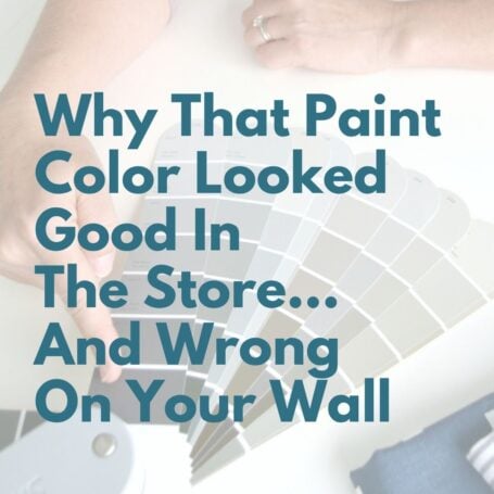
Choosing paint color shouldn’t feel this hard.
If you’ve ever painted a room and thought, well… that looked better on the swatch, grab my free guide. I’ll show you the simple trick for spotting undertones before you paint.
What Color Is Repose Gray SW 7015?
Sherwin Williams Repose Gray paint is a light tone neutral greige that pairs well with almost every decor style and color palette. It’s one of Sherwin Williams’ most enduring and popular grays because it allows you to have a mix of both cool and warm tones throughout your home on things like your furniture, flooring, and accent colors. If you're hunting for a neutral that isn't too cold or too beige, this one just might hit the sweet spot.
SW Repose Gray undertones
Here's where things get real. Undertones matter.
A soft violet is one of SW Repose Gray undertones that make it sometimes difficult to use in north-facing rooms or rooms without natural light because the violet undertone might be more noticeable in this cool light situation.
However when looking at the Repose Gray color strip you'll notice it also has brown and green in its base color to balance it out. In a south-facing room, it warms right up, looking more like a soft greige. In west- or east-facing spaces, expect some variation throughout the day.
If you’ve ever painted a wall thinking it was “just gray” only to see baby blue or lavender pop out of nowhere, you know the pain. Moral of the story: sample Sherwin Williams Repose Gray (or any paint color for that matter) in your space before making a decision.
Looking to test paint colors but don't want to paint? Samplize offers peel and stick paint samples from all major paint brands delivered to your door so you can put them up on the wall with no mess.
Is Sherwin Williams Repose Gray warm or cool?
Because this color has brown in its base it is considered a warm gray. This makes it less clinical looking and more cozy and inviting. Depending on the light conditions, Repose Gray 7015 might look cool in some cases due to that hint of violet undertone.
Repose Gray LRV
LRV (light reflective value) is a scale used to tell how light or dark a color is. The scale goes from 1 (blackest black) to 100 (true white).
Repose Gray LRV is 58.
Anything 45-100 is considered light but even Pure White (SW 7005) is 84 so in the grand scheme of things this is closer to a medium shade than it is the lightest shade.
You May Also Like


Examples of Rooms With An SW Repose Gray Color Scheme
Repose Grey walls in an open concept space
When you choose wall color, be sure to think about cohesiveness because open floor plans need a wall color that plays well across multiple spaces. Cass of Cass Design Co shows off Repose Gray walls at full strength in her great room. I love the timeless coastal vibe and the multiple windows show off the wall paint in a subtle way that’s not overwhelming and allow the white trim to pop.

SW Repose Gray living room
You can see here why Repose Gray living rooms are so popular. SW Repose Gray provides a perfect neutral backdrop for this contemporary rustic living room by Project Allen Designs, proving its quiet undertones look amazing with any decor style.

Repose Gray cabinets
Repose Gray kitchen cabinets are a popular choice because its versatility makes it easy to mix with virtually any type of countertop, flooring or trim. Emily of Table & Hearth transformed her kitchen by lightening up the formerly dark cabinets with Repose Gray color paint. The overall look she achieved is wonderfully bright and airy!

Repose Gray kitchen walls
If you have white or even light brown cabinets in your kitchen, Repose Gray by Sherwin Williams would be a great choice for a wall color because it will add a bit of warmth and make white cabinets subtly stand out and make brown cabinets feel more updated.
Repose Gray bedroom walls
Master bedroom with 7015 Repose Gray paint
Erica at Designing Vibes chose Repose Gray for her master bedroom walls because of its reputation for being a true gray with minimal undertones. She loves the soft welcoming feeling that Repose Gray Sherwin Williams interior paint added to her space without feeling cold.

Repose Gray color in a nursery
This is a great example of how versatile this neutral greige color is. Blooming Homestead shows off Repose Gray SW walls with cool accent colors of lavender and white. Using these accent colors with Repose Gray brings out the cooler side of the color, while eliminating any blue that often shows up in true gray paint colors.

Repose Gray bathroom
If full strength is too much, consider doing what Erin did in her bathroom at My Texas House when she used Repose Gray lightened 50%. This works great in a smaller space or room without much natural light, to add some color to the walls and create a clean and uncluttered look.

Repose Gray exterior paint
SW Repose Gray is a great choice when painting the exterior of your house because with its warm undertones it appears gray without looking too blue, a mistake I see way too often. And because it's a warm gray it pairs really well with the variations of both warm and cool tones you see in a lot of stone work tying everything together nicely.
SW Repose Gray Vs Other Greige Paint Colors
Mindful Gray vs Repose Gray
Mindful Gray SW 7016 is a bit darker than Repose with an LRV of 48 and a more prominent brown undertone. Both Repose and Mindful represent a solid balance between warm and cool tones but if your room is small and dark, Repose Gray will be the better choice to brighten it up because its lighter shade will bounce light around the room better.

Agreeable Gray vs Repose Gray
Agreeable Gray SW 7029 and Repose Gray are similar, but Agreeable Gray tends to be warmer, with more true chocolate brown undertones which is why you see a bit more warmth in the side by side comparison below. Agreeable Gray has a slightly higher LRV of 60, making it a slightly lighter color.
Repose Gray has less brown/more black in the undertone than Agreeable Gray, making it cooler. Both of these colors are timeless but if you’re looking for a gray that leans toward tan without being too pink, Agreeable Gray is the better choice.

Requisite Gray vs Repose Gray
Requisite Gray SW 7023 is quite a bit darker than Repose Gray and has a much stronger violet undertone. Requisite Gray works better in bright rooms with a lot of warm light to balance out its cool undertones.

Silverpointe vs Repose Gray
Despite both colors sitting in the mid-range, Silverpointe and Repose Gray are very different.
Silverpointe is cooler toned, with green and a little bit of blue undertones and it's a bit lighter with an LRV 64. If you're looking for a light neutral with a hint of green that will create a cool atmosphere in your home, Silverpointe will definitely fill the bill.

If you're struggling to narrow down your paint choices, the super simple trick is to get samples and stick them on your walls side by side. Seeing an SW Repose Gray paint sample alongside your other favorite colors will make your paint decisions much easier.
You May Also Like


Repose Gray Coordinating Colors
If you choose to use Repose Gray as your main neutral wall color the next question is...
What are colors that go with Repose Gray?
Because it has both cool and warm undertones it really can go with almost any whole house color scheme even if it includes both warm and cool colors. This neutral bridges the two together nicely.
A student in my online decorating course used Repose Gray as the main neutral throughout their home paired with deep blue-gray and burnt orange accent colors.

In the rooms you saw earlier in this post it is easy to see that Repose Gray accent colors can be anything from lavender to orange. It really is that versatile.
What white goes with Repose Gray?
Sherwin Williams Simple White 7021 matches well with Repose due to sharing the same whispery violet undertones.
If you’d like a stronger contrast, Sherwin Williams Pure White 7005 is a lighter brighter white and a no-fail trim and ceiling color. (You can't go wrong with Repose Gray with Pure White trim. It's my personal go-to for all the trim in my own home.)
What color cabinets go with Repose Gray walls?
White cabinets with Repose Gray walls is probably the most common combo. The cabinets can be bright white or a warmer white, both will look great.
You can also pair Repose Gray walls with light tone wood cabinetry. In this case the warmth of the paint color will be more evident.
Want more help creating your own cohesive palette? Don’t miss my post on how to create a whole house color palette!
Final Thoughts: Is Repose Gray Right For You?
At the end of the day, Sherwin Williams Repose Gray is a crowd favorite - but that doesn’t mean it’s right for everyone.
If you're choosing paint colors and want a neutral that:
- Looks great in a variety of lighting
- Works in both modern and traditional homes
- Coordinates with a range of colors and finishes
- Holds up beautifully over time
… then it’s absolutely worth sampling.
Still feeling stuck or second-guessing your paint choices? Don’t worry - I’ve got you. Head over to my post on How To Choose Paint Colors + The Best Neutral Paint Colors To Consider for a deeper dive and even more favorites to sample.
Because picking paint shouldn't feel paralyzing - it should feel like the exciting first step to creating a home you love.


P.S. There's no better way to create a cohesive feel than with color, but in order to avoid mistakes and get an updated look you've got to understand color like a designer.
Inside my online course, Color Made Clear, I will teach you exactly what you need to know about selecting colors for your home in everything from paint colors, to flooring and carpet, to fabrics so you can make confident color decisions and get the exact look and feel you're going for. - Even if there are finishes in your home you can't change, I'll show you how to use color to distract from them for an updated look!
Frequently Asked Questions - Repose Gray
What color is one shade lighter than Repose Gray?
When you look at the Repose Gray color swatch you'll notice that it is the lightest shade. If you're looking to use this color but want to go lighter, you can have it mixed at 75% or even 50% lighter to keep the undertones true but have it less saturated.
Is there Behr Repose Gray or Valspar Repose Gray?
No. Repose Gray is a Sherwin Williams neutral greige paint color. If you want to use Behr or Valspar paint you can ask to have this color mixed for you, but for the most true to color use the Sherwin Williams brand.
