6 Easy Steps To Create a Whole House Color Palette

Struggling to figure out how to create a more cohesive look in your home? The answer may be simpler than you think. Start by creating a whole house color palette.
A whole house color palette gives you a set of colors to repeat throughout your home so your rooms feel connected, even when the furniture, finishes, or decorating styles vary from one space to another.
Whether you're going for a soft and relaxing color scheme or something more colorful and energetic, having a defined home color palette will help your home feel more cohesive and make decorating decisions a whole lot easier.
Today I'll walk you through six easy steps to create your own whole house color palette. I've also got a free Color Palette Cheat Sheet you can download to help you work through the process.

In This Post:
What Is A Whole House Color Palette?
A whole house color palette goes beyond simply choosing paint colors for your home, although choosing paint is definitely part of it.
Your palette includes the main colors you'll repeat throughout your home in different ways. It can help you choose paint colors, coordinate different wood tones and finishes, and decide which accent colors to use in your furniture, wall decor, accessories, rugs, and textiles.
And here's the important part: every room doesn't need to look the same.
A whole house color palette simply creates a common thread from one room to the next. You can use different amounts, shades, and variations of your colors in each space while still creating a home that feels connected.
Why Creating a Whole Home Color Scheme Makes Decorating Easier
Repeating colors throughout your home is one of the easiest ways to create a cohesive look, even when the style of your furniture and decor varies.
Your whole home color scheme also gives you a starting point for future decorating decisions. Instead of looking at every paint color, pillow, rug, or piece of art and wondering whether it will work, you have a framework for narrowing your choices.
And believe me, fewer choices aren't a bad thing when you're decorating!
When you have a plan, you're less likely to make decorating mistakes, which can save you time, money, and frustration. Most importantly, it helps you create a home that feels pulled together without feeling overly matched or "designed."
How to Create a Whole House Color Palette in 6 Easy Steps
You don't need to understand complicated color theory or start over with everything you already own. In fact, most of us are creating a color palette around at least a few existing finishes, furnishings, and colors.
The goal is to take what you have, figure out where you want to go, and create a simple color plan that connects your rooms.
🎨 Creating your own color palette?
I made a free Color Palette Cheat Sheet to go along with the steps below. Use it as you work through the process to keep track of your colors and create a palette that works throughout your home.
Step 1: Decide How You Want Your Home to Feel
Color plays a huge role in how your home feels, so before you start picking specific colors, think about the overall mood you want to create.
Start by taking a look at the existing colors in your home:
- Do they make you feel how you want to feel in your home?
- Are they too dark, too light, or too bright?
- Do they reflect your decorating style?
- Do they feel too stark, dingy, or boring?
Now think about how you want your home to feel.
Do you want it to feel:
- Calm and relaxed?
- Warm and welcoming?
- Light and fresh?
- Sophisticated?
- Colorful and energetic?
There isn't one color combination that's right for everyone. How certain colors make you feel is personal, but thinking about the mood you're trying to create gives you a much better starting point than simply choosing colors because they're popular right now.
A quick note about color: You don't need to be an expert in color theory to create a beautiful whole house color palette. Colors that are similar tend to create a calmer, more harmonious feeling, while colors with more contrast add energy and interest. Neither is right or wrong. It depends on how you want your home to feel.
Step 2: Look at the Colors and Fixed Finishes You Already Have
Unless you're building or remodeling an entire home from scratch, you probably already have colors that need to be considered.
Look at the things that aren't going anywhere anytime soon, such as:
- Flooring
- Countertops
- Tile
- Cabinetry
- Stone or brick
- Large pieces of furniture
- Wood tones
Pay attention to the undertones and overall temperature of these finishes. Are they mostly warm (browns, reds, yellows) or cool (blacks, grays, blues)? Are there colors that repeat in several of them?
You don't have to match your color palette to every existing finish. The goal is to choose colors that work with the things you're keeping instead of accidentally fighting against them.
This step is especially important when you're choosing neutral paint colors and whites. A beautiful paint color in someone else's home may look completely different next to your floors, countertops, cabinets, and furniture.
Step 3: Find Color Schemes That Inspire You
Of course flipping through magazines, browsing the internet, and scrolling Pinterest and Instagram are great places to find color inspiration, but don't stop there.
Start noticing color combinations you're naturally drawn to in other places.
Do you have a favorite outfit with a color combination you love?
Is there a particular jewelry or metal finish you're always drawn to?
What about the color scheme of a hotel or restaurant you loved?
It could even be as simple as the colors in a favorite piece of art, a rug, curtains, or a patterned pillow.
You may start noticing that the same colors show up again and again in the things you save. That's a pretty good clue about what you actually like, regardless of what's currently trending.
Once you've gathered some inspiration, create a simple color moodboard or gather paint swatches so you can begin playing with different combinations, shades, and tones.
Step 4: Consider the Lighting Throughout Your Home
Both natural and artificial lighting greatly affect the way a color looks on your walls and in your space. And because you're creating a whole house color palette, the same color may need to work in rooms with very different lighting.
A few rules of thumb:
Direct natural light is typically warmer and can make warm undertones appear even warmer. For example, a warm white in a room with lots of warm natural light may appear more yellow than you expected.
Indirect natural light tends to be cooler and can emphasize cool undertones. A gray with a blue undertone, for example, may suddenly look much more blue or even purple in certain rooms or at certain times of day.
Artificial lighting matters too. The color temperature of your light bulbs can dramatically change how paint, furnishings, and finishes look, especially at night.
This doesn't mean every room needs a completely different palette. It means you need to see your colors in the actual spaces where you'll be using them before making a final decision.
COLOR TIP: Evaluate your colors together, not individually.
One of the biggest mistakes people make is choosing colors one at a time. A color might look beautiful on its own, but your whole house color palette needs to work with the other colors and finishes already in your home.
Before committing, look at your colors together alongside your flooring, countertops, cabinetry, wood tones, and other fixed finishes. Then check them in your home’s natural and artificial light. This will help you spot undertones that clash and create a palette that actually feels cohesive from room to room.
Step 5: Choose 3-5 Colors for Your Whole House Color Palette
Now it's time to actually build your palette.
A good rule of thumb is to stick to about 3-5 main colors for your interior color scheme.
For those of you who love color, that may feel limiting, but I promise you can still end up with a colorful home. You'll use different shades and variations of those colors, so you aren't restricted to five exact colors.
And if you're a bit afraid of color, choose more muted versions of the colors you love. You can bring color into your home without it screaming at you every time you walk into the room.
Select a Main Neutral Paint Color
This will be your go-to color for walls that connect rooms, such as hallways and open living spaces.
And neutral does not automatically mean tan or beige.
A neutral can absolutely be a color. Subtle shades of blue, green, and gray all count. My neutral is a greige, that perfect blend of beige and gray.
If you haven't already read my posts on how to choose neutral paint colors and how to choose the perfect greige paint, go do so now. Both will sharpen your eye for color and make every paint choice easier moving forward.
Go ahead… I'll wait right here.
Select a White
Next, choose your go-to white for things like trim, ceilings, the insides of closets, doors, and possibly cabinetry.
Be warned, not every white is the same.
They may all look white in the paint aisle, but just like every other color, whites have undertones. You'll want to choose a white based on the undertones in the fixed finishes you're working with, such as cabinets, flooring, countertops, and furniture.
Select a Darker Color
Next, choose a darker color to add some contrast and depth.
This color may make it onto a wall, cabinetry, or a painted piece of furniture, or it may simply become a jumping-off point for accessories and textiles.
If you love color, this probably won't be difficult for you. If you're a bit more hesitant, don't worry. You don't have to use the darkest version of the color everywhere.
For example, I love deep blue. Deep blue is one of the main colors in my palette, but when it came time to paint my bedroom, I chose a lighter version of blue. It still works with my whole home color scheme without making the room feel too dark or bold.

Select Your Accent Colors
Your remaining colors can be used as accents throughout your home.
These might be brighter pops of color or variations of colors you've already selected. You'll use them in accessories, art, rugs, pillows, curtains, and other textiles. You might even use one on an accent wall, cabinetry, or in a small room like a powder room.
The colors you choose for your home are entirely up to you. Pick the ones that make you feel fabulous, because who ever gets tired of feeling that way?
Step 6: Repeat Your Colors Throughout Your Home
This is where a whole house color palette really starts doing its job.
Creating cohesion doesn't mean using every color in every room or repeating the exact same combination everywhere. In fact, doing that can make your home feel overly matched.
Instead, think about creating a visual thread from room to room.
A color that's dominant in one room might show up as a small accent in the next. A deep blue wall in one space might become a blue pillow, piece of art, or patterned rug somewhere else. You can also use lighter, darker, brighter, or more muted versions of the same colors.
The repetition is what creates the connection.
This also gives individual rooms permission to have their own personality. One room might feel lighter and more neutral while another has more color and contrast, but because they're pulling from the same overall palette, your home still feels cohesive.
You can see exactly what I mean when you look at how I've used my own palette throughout our home.
My Whole House Color Palette Example
Most of the color schemes in my home would probably be considered fairly monochromatic, with lots of blues, whites, and grays. But I've added complementary accent colors here and there to give the rooms the pops of color I love.
I keep the palette from feeling too kid-like by choosing colors that are bright but often slightly muted rather than using lots of primary colors.

My Family Room Color Scheme
In my family room, I use variations of my neutral greige throughout. My main color is blue, but I don't stick to just one shade. I use several blues and even some teal.
Then I bring in pops of color with light lime greens and yellows, along with very small amounts of pink.

In the same room, we created a large built-in and I made it pop by painting the wall behind it a darker variation of my blue. Then I added small amounts of yellow and pink through the accessories.

My Kitchen Color Scheme
Because the family room opens directly into the kitchen, a light blue glass tile backsplash helps keep my whole house color palette cohesive between the two spaces.
I sprinkled variations of blue throughout the kitchen too, from turquoise to deep saturated teal. The colors aren't identical to the family room, but they clearly belong to the same palette.

My Living Room Color Scheme
The living room is the first room you see when you walk into our house, and it's definitely the lightest and brightest space, with lots of blues and white.
This room has changed a lot since we moved in. And although it leans a little more coastal than some of the other spaces in our home, the consistent color palette connects it to the rest of the house.

My Dining Room Color Scheme
My dining room has changed over the years too, but it follows the same idea: subtle colors with repeated pops of blue and teal.
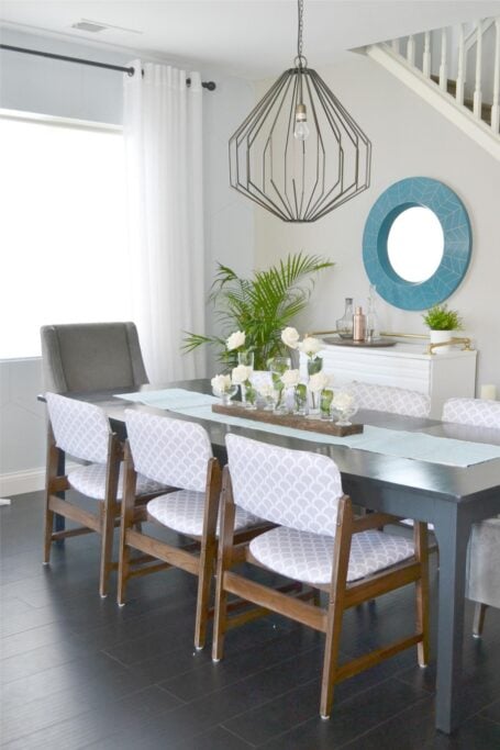
Don't be afraid to use your colors in different ways from one room to the next. Paint an accent wall or a piece of furniture. Pull a color into a rug or artwork. Use a softer version of a bold color in another room.
As long as colors from your palette repeat throughout your home, you'll create a sense of connection and flow, even when the furniture and decorating style vary.
A Whole House Color Palette Gives You a Plan
My home is always a work in progress, but having a whole house color palette gives me a framework for making decisions as our rooms evolve.
If I had to pick one thing that can make a home feel more cohesive, it would definitely be color. Having a set of go-to colors makes decorating decisions easier and helps create a natural flow from one room to the next.
Whether you're a color lover or prefer to keep things calm and neutral, you don't need to find the one "perfect" color scheme. You need a palette that works with your home, reflects what you love, and gives you enough direction to make your next decorating decision with confidence.
And if choosing the actual paint colors for your palette is your next step, read:


Still second-guessing your color choices?

Knowing the colors you love is one thing. Knowing which ones will actually work together in your home is another.
In my Color Confidence Workshop, I'll show you how to use color intentionally so you can make confident decisions and create a home that feels cohesive and pulled together.
Instant access • Watch in under an hour • $17

Frequently Asked Questions - Whole Home Color Palette
My colors don't flow from room to room. Help!
Creating a home that flows nicely from one room to another can definitely be challenging. Over the years I’ve worked hard to create a cohesive look in my home and I share my secrets with you in this post.
My walls are beige and sofa is grey; please help me pick colors for curtains and rug.
Since I can’t see your home in person, I can’t offer specific color/decor advice. Defining your home decor style will narrow your choices and make the process less overwhelming. This post I wrote will show you how to make your decorating choices much easier.
What are the paint names for your pictured color palette (5 color chips)?
Grey = Requisite Grey; Turquoise = Cooled Blue; Teal = Briny; Yellow = Eye Catching; and Pink = Heartfelt (all Sherwin Williams colors). You can find more details on my house paint colors here.
How do I mix different furniture wood tones with a color palette?
Keeping the undertones, grain or texture similar within a space is a good rule of thumb. Try to have each piece have a buddy in each space so it looks intentional and separate pieces that a different to reduce the impact. This post I wrote about mixing styles might be helpful for you too.
How much of each of the color types should I use?
The pro rule is a 60-30-10 ratio: 60% dominant color, 30% secondary color, and 10% accent color(s.) But I say do what feels good. Get your base down (wall color and trim) and then add in color until it feels just right. I like to add color around the room at different heights so that your eye naturally catches in different parts of the room.
I want to totally redo my house but don't know where to start.
Wall color is a great place to start and if you can afford to replace any of the staple items like a sofa, do that too. Once you have those in place it is just a matter of making items you already have work with your space. You can always change the color of something (like a large piece of furniture) with paint. Then add your pops of color a little bit at a time with things like pillows, curtains, and accessories.
How do I know if my wood cabinets will look good next to the color I chose?
Place your paint samples right up against the cabinets to be sure that the tones in the wood pair well with the wall color.
Is it okay to paint all the walls throughout just one neutral color? It feels like too much.
It's totally okay but if you feel like it is too much, you can do an accent wall in a color or even go up or down a shade of the neutral you already have to give a little contrast. Beyond that you can change it up from one room to the next with your accent colors. Maybe have the main accent color be different in each space while still incorporating the same color palette throughout.
